

Something kind of amazing happened this week. If you’ve been following the saga of our leaking studio roof, then you’ll be glad to hear that the contractors finished replacing the ceiling and walls this week, and the studio is back up and running again. Hoorah! But that’s not to say everything is back to normal exactly… the contractors tried to put everything back the way it was but it’s actually quite comical where things ended up …and we have found ourselves having to stop work and hunt for important items in some pretty illogical places!
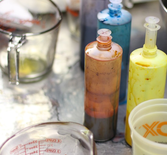
But here’s what’s amazing: the studio has been completely repainted and, instead of the dark army green it was before (yep, that’s what the previous owner went for…), we now have a beautiful light grey on most of the walls and the first thing we noticed is how much it changes the light. And not just from an HGTV “wow, the room seems so much bigger” point of view, but it actually changes the way the yarn looks as we’re dyeing it!
I suppose that’s perfectly logical when I think about it, but we were just so used to the old wall colours (and actually didn’t have the option of changing them) that, after a while, I don’t think we noticed anymore. But with the new paint so much lighter and more neutral, it’s easy to see that the old wall colour had an effect on how the dyes looked to our eyes. Now the dyebaths fairly glow and the skeins seem so much brighter. It’s exciting!
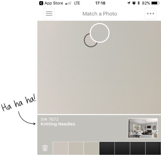
Oh, one other thing that made me laugh. The new wall colour is actually called Olympus White but when I couldn’t remember that, I opened my handy Sherwin-Williams app and took a picture of the wall. Here’s what colour it told me it was… I can’t think of anything more appropriate!
Ok, I’ve got a bunch of great stuff to share with you this morning, so let’s get go ahead and jump in. Grab a cuppa and find a comfortable spot, and here we go!

Last week I shared Dot Matrix (below) with you, a beautiful new pattern from Corrine Walcher that uses our Linking Sweater Sets and features true seams and set-in sleeves. Knowing how to properly seam a garment is an important skill for a knitter to have but if it’s got you a little spooked, this wonderful tutorial from Amy Herzog is just what you need to guide you through every step.
There are lots of excellent knitting magazines out there, but very few dedicated to men’s knits so I’m excited to come across Rib Magazine. Describing itself as “an ever-evolving, inspirational library of men’s knitwear patterns that highlights the renaissance of men returning to the craft and art of knitting,” I think it’s a wonderfully intriguing addition to the knitosphere!
This article in the Telegraph (of London) reports on calls for Britain’s National Health Service (NHS) to start prescribing knitting as a treatment to lower blood pressure, reduce depression, and slow the onset of dementia (key question: does quality fiber content improve medical results?). I have no doubt that anyone’s health can be improved with the addition of knitting or crochet, but the two things that really caught my eye were further down in the article: first, the inspiring work of the charity Knit For Peace and, second, the comment about how “little known the research is” on the health benefits of knitting. (…*cough* hands up everyone who already knew knitting and crocheting are good for your health!)
What’s the biggest project you’ve ever made? A sweater? A blanket? Maybe a whole sweater-coat? Be prepared to be blown away by this fiber artist who crochets* whole people (plus their entire outfits!) who are amazingly accurate to the people they are modeled on. Absolutely stunning! (*they look crocheted to me — do you think so?)

Carol’s Amazing Pooling
I spotted this amazing sweater last week on Instagram and just had to share it with you. It’s knit in a custom colourway we dyed for River Colors, a wonderful LYS in Cleveland, and I so enjoyed creating that red, yellow, and black theme. But the thing about this photo that stopped me in my tracks is the way the colours pooled into an amazing pseudo-argyle pattern in the body of the sweater. Isn’t it stunning?!? And look how different it looks from the sleeves. Gauge makes all the difference with any variegated yarn. And sometimes, when the gauge is just right, magic happens! Click here to show Carol a little colour-pooling love!

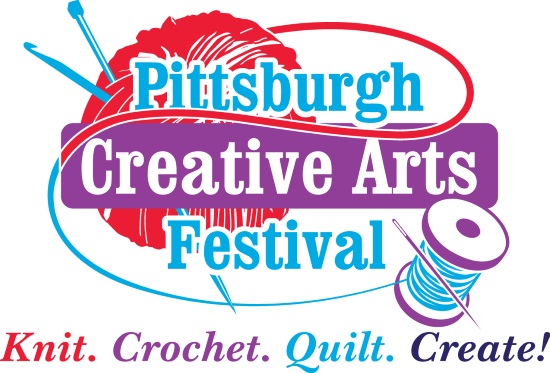
Pittsburgh Creative Arts Festival
David L Lawrence Convention Center, Downtown Pittsburgh PA
(Click here for directions and parking info)
Marketplace Hours:
Friday, April 6 – 12:00 Noon to 7:00 PM
Saturday, April 7 – 10:00 AM to 6:00 PM
Sunday, April 8 – 9:30 AM to 3:30 PM
Featuring books by double-knitting master Alasdair Post-Quinn!

Shoreline Scarf by Rebecca Velasquez
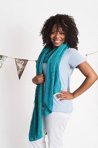
There’s a story behind this beautiful design: originally, Rebecca started it with a skein of SpaceCadet Thebe in Honey and when she realised she needed a second skein, we had that age-old problem of mismatching dyelots (which means, it happens to everyone — even top-notch published designers!). Fortunately, we were able to sort her out with Feather, this beautiful teal blue, and the design took shape at last! A simple scarf for a new crocheter, it only uses three stitches for an easy crocheting experience. Check it out in the April issue of I Like Crochet magazine.
Sunnydale Cowl by Katy H. Carroll
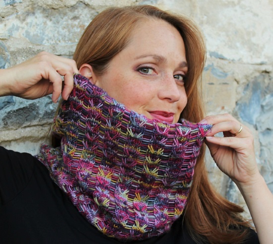
Variegated yarns are so pretty in the skein, but they can sometimes drive you bonkers if the colors and stitch pattern are competing. So I love this cowl, which is specifically designed to showcase wildly variegated yarns, and uses a combo of elongated and dropped stitches to create a lightweight, open fabric that works with a crazy skein of fingering beautifully. Try it with Molten Cool, Windswept, or Vortex.
Meditation on the Beach Shawl by Brenda Castiel
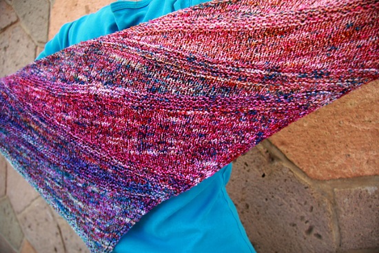
Look closely at this shawl and you’ll see that it’s worked up in stockinette short row sections and garter stitch stripes, created to flow through a gradient fade for an intriguing knit with a stunning result. Designed for a sport weight yarn, I’d actually love to see it knit in our Ombre & Gradient Mini-Skeins held double, because two fingering yarns together are a good DK/Sport substitute, and the colourways blend to produce an amazing mottled effect. So grab two bundles from your stash and cast on!
all images © the respective designers, used with permission
Ok, I’d better get going because we’re setting up for the Pittsburgh Creative Arts Festival today, so I’ve got a long and exciting day ahead of me. I hope your day is just as exciting (and maybe a little warmer?) and, until next time time, all my best!
My family room is Knitting Needles! And my kitchen is Alpaca. 🙂
Oh my stars, how awesome is that?!?