
I’ve been doing some work on the SpaceCadet website* and I’ve noticed something that surprised me so much that I just have to stop everything right this minute to share it with you: what you see on your screen may not be what our yarn actually looks like. In fact, your computer or mobile device may be deceiving you.
We all know that different computer monitors display things slightly differently. Each monitor has its own settings that can be adjusted to either the manufacturer’s presets or to your own liking, and those adjustments impact the way images — and, more crucially, colours — appear on the screen. That’s the reason we mention on each yarn’s sales page to “…please remember that our photos are as accurate as possible, but the colours you see also depend on your computer monitor’s settings.” But I also know how easy it is to skip the small print when the page is filled with pictures of delicious yarn.
How Your Monitor Shows Colours is Critical When Buying Yarn!
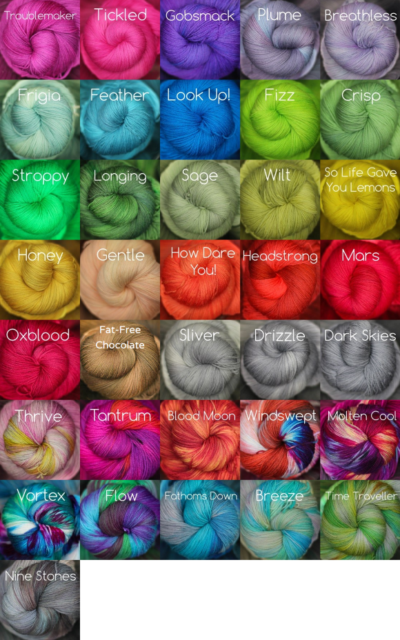
But I got a reminder about how import that little detail is while I was working on the website. We’ve been working hard this year to expand and revamp our palette of colourways, and I was adding a section to the front page that looks like this:
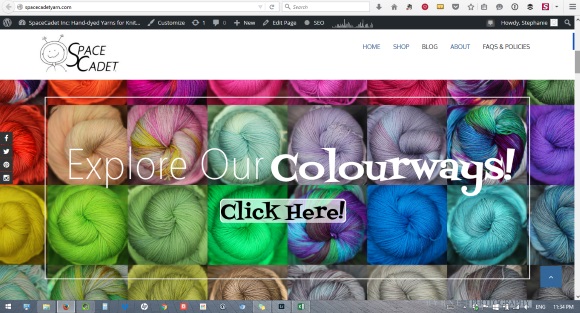
As I was making changes, I’d check the website on my computer (a desktop pc) to make sure the changes were coming out right. Another adjustment, another check… another adjustment, another check… As it began to come together, I was getting super excited about the results. And then, I checking on my iPhone, and I was kind of shocked by what I saw!
Better Pictures May Mean Disappointing Yarn…
Everyone knows that Apple is all about the visuals: retina screens and vibrant images, with colours so intense they jump right out of the monitor. And that’s great when you’re looking at your vacation photos — you’ve never taken such amazing shots! — but it may not be the best thing when you’re trying to buy yarn. Here at SpaceCadet, we are essentially in the business of selling colour over the internet, and so to make sure our customers get what they order, our images need to represent our colours as accurately as possible. With that in mind, check out how that same webpage section looks on my iPad:
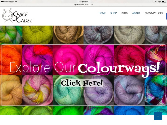
It aligns itself a little differently on a mobile device but, don’t worry, it’s the same spot on the website. But here’s the important thing: take a look at how differently the colours come across on the iPad — how much more intense and vibrant. Do you see Frigia, that very pale blue? On my desktop, it’s true to the actual colour — a very pale and sublime icy blue. But on my iPad, it appears to be a much more intense blue, more intense than the yarn truly is. And the iPad image actually has a greenish tinge — look at the edges of the yarn and you’ll see what I mean — that isn’t there at all in the actual yarn. Here, it’s easier to see if I put them side-by-side.
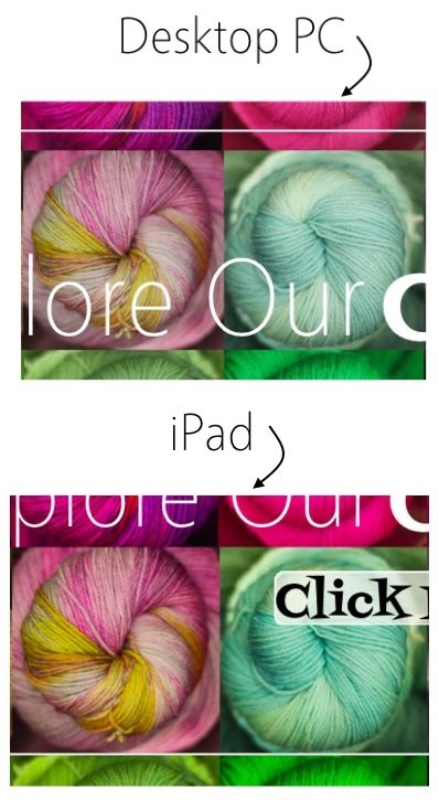
And while you’re looking, check out the two greens in the row below the blue. See how completely different they look on the iPad vs the pc? Now, full disclosure: because the difference is in each devices’ screen and not in the image data itself, I had to adjust the iPad image in Lightroom to accurately reflect here how different they look in real life. But I worked very hard to get the images true and you can easily test it live for yourself: if your computer and phone are manufactured by different companies, just click here on both your phone and your desktop/laptop to bring up our colourways page and then compare what you see on the two devices (note that if both your phone and computer are Apple, you probably won’t see the difference, and I haven’t yet tested this on non-Apple phones).
The pictures here can’t really do it justice, but when I held my phone up and showed that live side-by-side comparison to my assistant, she actually gasped. “That green is glowing! Like it’s… like it’s radioactive or something!” She was talking about the colourway Stroppy — take a look at your devices side-by-side and you’ll see she’s right. I don’t think we could achieve that kind of a glow in real life without dropping some plutonium in the dyebath! And, again, if you look at Frigia and Feather, there is that slight yellow cast giving them both a green tinge that they simply don’t have.
Ok, So What Do We Do?
So ok, you can see what an impact different screens make to how our colours appear, but the big question is, what do we do when our customers are shopping for yarn online and their devices are representing our colours in these different ways? In all honesty, I’m not sure. I think that all I can do is continue to take pictures that are as true to our real-life colours as I possibly can, and then to share this information with you so you are aware. And it’s not just the SpaceCadet website that is affected, of course — it’s every website you visit on a device that intensifies colours. Yes, your vacation snaps suddenly look amazing, but when you’re shopping for yarn on our site or another dyer’s site, when you’re looking at clothes or housewares online, or when you’re choosing paint or fabric, just bear in mind that those incredible colours may not be all that true to real life.
And if what you’re looking for is radioactive yarn and you think you might’ve found it, well… I may have to disappoint you. But if you’re looking for a colour that will make you gasp — and in a really good way this time — we can certainly help you out!
Hey, if you think this screen-settings issue is one your knitting and fiber friends should know about, please share this post on Facebook (click here) and Twitter (click here) and Ravelry.
*Please check out the front page and tell me what you think. Does it look good on your device? Is it easy to find your way around? I’ve worked really hard on it and I’d love your thoughts. Just email missioncontrol(at)spacecadetyarn(dot)com and let me know — seriously, I’d be so grateful for your feedback.
 The Folks on our Mailing List get More!
If you found this post useful, you’ll want to get on our mailing list. Each week(ish) we send out a newsletter packed with all the latest that’s happening in the world of yarn, plus pattern picks, our pop-quiz, and more! And, when you join the list, you…
Get Our FREE eBook with Great Tips & Hacks from the Top Indie Designers!
Out of curiosity, after reading your post I popped over to Settings on my iPhone and turned off the “True Tone” setting. When turned on, Frigia (and everything else) had a yellowy-green cast to it, but with it turned off Frigia looked much more mellow, soft blues. Maybe turning “True Tone” off for yarn shopping will help.
Ohhhhh! Interesting! I will play with that and, if it seems to be the answer, update this post. Thank you!
I have been ordering yarn on my IPhone for years since almost all of our LYS have closed. Your research is absolutely eye opening! Thank you for all your investigations into this matter. I recently purchased a lap top so I’m good now, but it definitely explains the majority of my disappointments with yarn orders. Thank you for your important information!
I just compared my Asus laptop and Samsung phone side by side and the difference was amazing! I know my laptop shows colours pretty accurately based on purchases I’ve made in the past. At least I know now to never trust colours on my phone and I’ll wait till I have my laptop available to make any purchases.
The website is beautiful. I love the scrolling screen that seems to move around the pictures. It reminds me so much of the 6 bits storybook site which I just saw yesterday and thought was incredible. I know you and Mel collaborate on a lot of stuff. The site is gorgeous. And thank you for your blog posts. I always enjoy reading them so much. I find them both interesting, insightful and also pertinent to things I am doing or learning about or that affect me. My favorite posts were of course about taking better pictures. I loved those entries. Thank you again, Stephanie for all of this, not just your beautiful yarn. Btw, loving all the new tonal colors (is that the right word?) I love, love, love the colors.
Want another shock? Take one of your pictures and put it against a black background, instead of white. I used to edit my photos in two different programs depending on what I wanted to do. One had a black background and the other white, and the color differences were so striking it was quite frustrating until I learned how to get both programs to have a black background. I chose black because my blog had a back background, but I also prefer it because the colors are more vibrant and come forward against the black while the white makes them recede and drabs them a bit. One thing is certain though. There’s no bad way to look at Space Cadet yarn!