Welcome! If you’re a 6 Bits podcast listener and you’ve got your exclusive download, here are some images that really illustrate what Stephanie and Melissa are talking about…
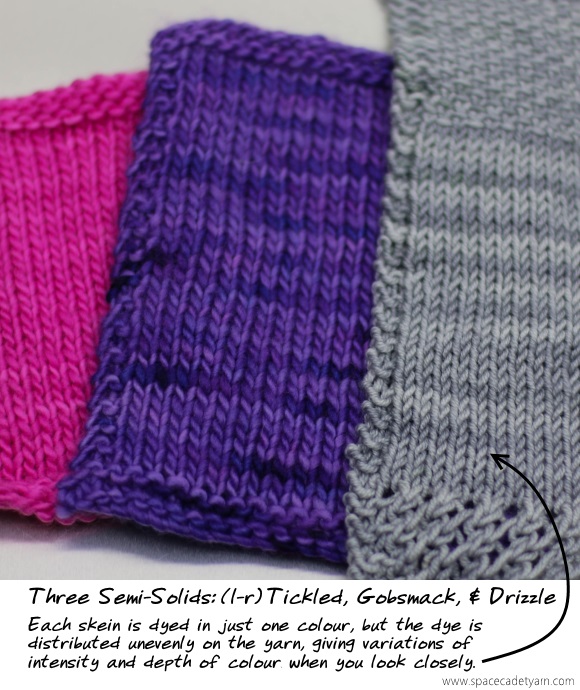
Semi-Solids
This image illustrates the variations of depth of colour in hand-dyed yarn. Where the colour distribution was uneven in the dyebath, it produces beautifually uneven results in the final yarn.
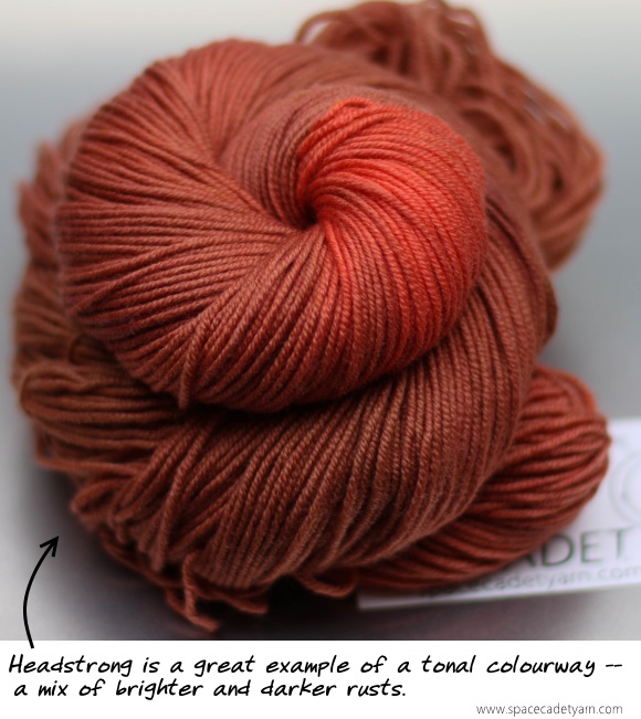
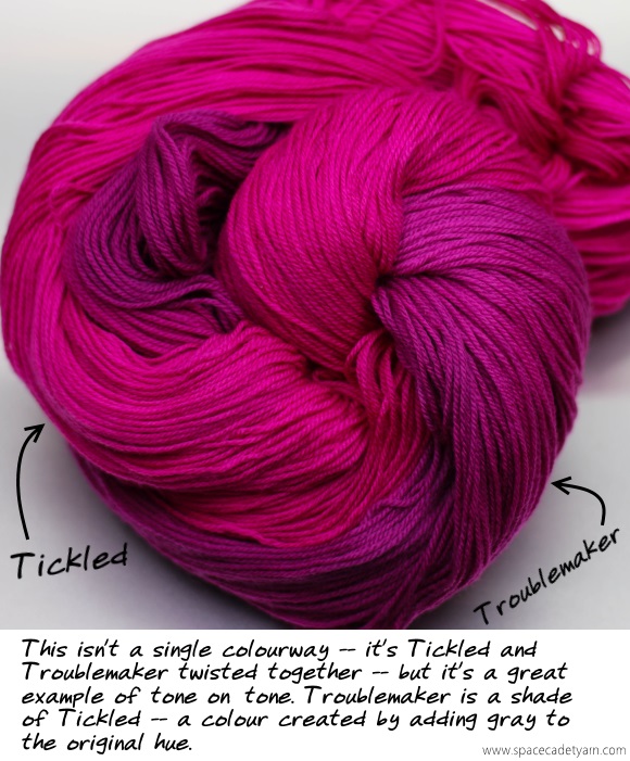
Tonals
Two examples of tonal colourways, and an illustration of tones vs hues.
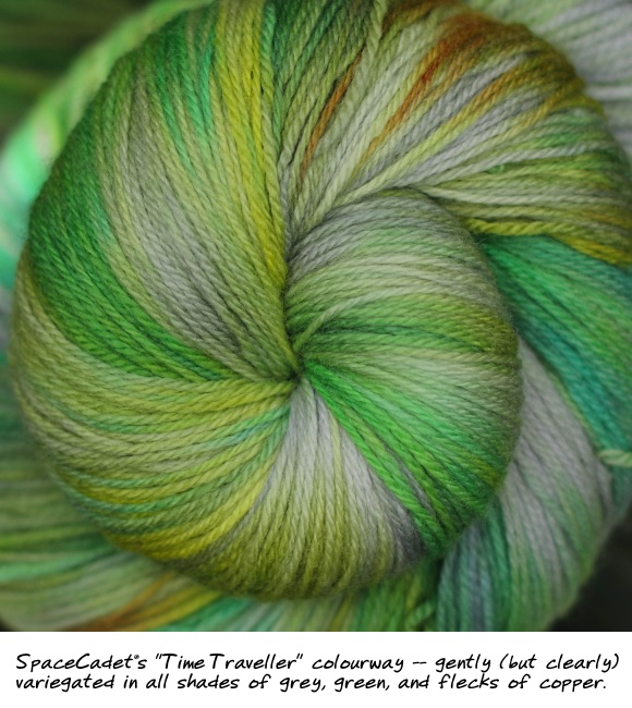
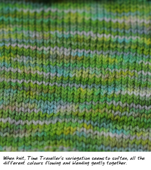
Gently Variegated
SpaceCadet’s “Time Traveller” colourway is a great example of a Gently Variegated, where the colours are low contrast and flow into each other.
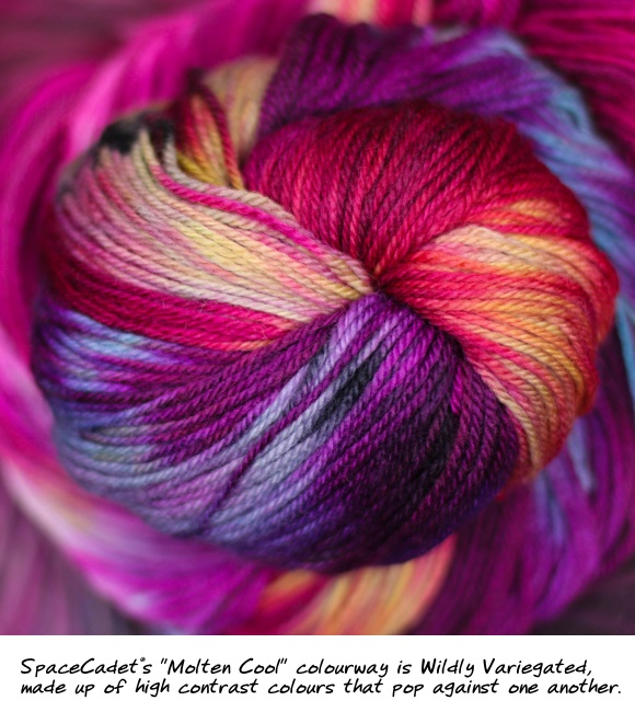
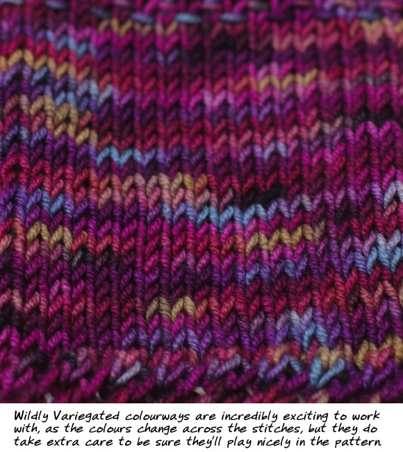
Wildly Variegated
SpaceCadet’s “Molten Cool” features high contrast colours that hit spots all over the colour wheel.
The Impact of the Length of the Colour Repeats
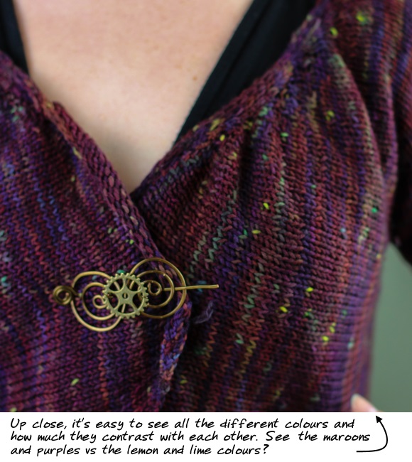
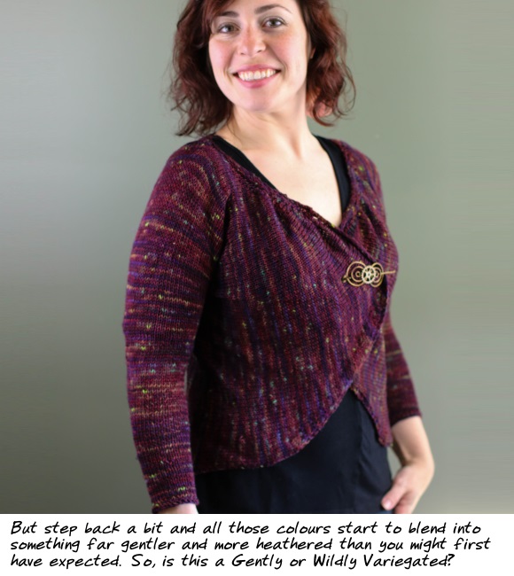
Here is a great example of a colourway with very high contrast — everything from purples and maroons to aqua, lime greens, and even yellows — that doesn’t look all that wild at all. Because the main colour is consistant and the colour repeats of the contrasting colours are short, the overall effect is actually fairly gentle — proof that a wildly variegated yarn doesn’t have to be that wild after all.
The Importance of Your Monitor’s Settings
Click here on both a phone and desktop/laptop to compare side-by-side the impact of screen settings on the colours you see.