

In my job, I take a lot of photos — a lot — and I have to tell you that when I first started dyeing, I didn’t realise how critical photography would be. But in an internet-based business where you can’t reach into the computer to smoosh each skein in your own hands or see the samples in person, it’s the photography that has to fill in the gap.
And the good news is that I’ve found I really enjoy taking photos! While I would never call myself a photographer, I’ve certainly learned a lot in the last few years that helps me to make a pattern sample or skein look its very best. Sometimes the most simple changes can take a photo from “nice enough” to really spectacular. And since I know we all take photos of our finished objects — maybe not for a website or an ad as I do, but certainly for our project pages on Ravelry — I thought I’d share some what I’ve learned in a series of posts over the next few weeks. Are you ready for better photos of your beautiful finished projects? Photos that really capture all the work and creativity you put into them? Great — here we go!
The Importance of the Background in Project Portrait Photos
When you’ve been working for weeks — maybe months — on a gorgeous new sweater or shawl or some other garment, the best way to show it off is to wear it. Whether you think through your photoshoot carefully ahead of time or just grab some snaps on your cellphone at knit night, there’s a simple thing you can do to really improve the final result: get the background right.
Don’t Stand in Front of that Bush!
Now, I have to tell you that I have a BIG pet peeve here: I hate the standing-in-front-of-a-bush photo. Everybody does it, whether it’s for finished object photos or family photos or whatever, and I know it seems like a good idea at the time but, everytime I see it, my toes curl. Bushes are perfectly nice, but they rarely make good photography backgrounds because they are just too busy. And the busier or more patterned the background, the harder it is for your eye to know where to look. All those hundreds of little leaves? They’re completing for your viewer’s attention. And very often the result of a standing-in-front-of-a-bush photoshoot is that your beautiful project kind of just blends into the background.
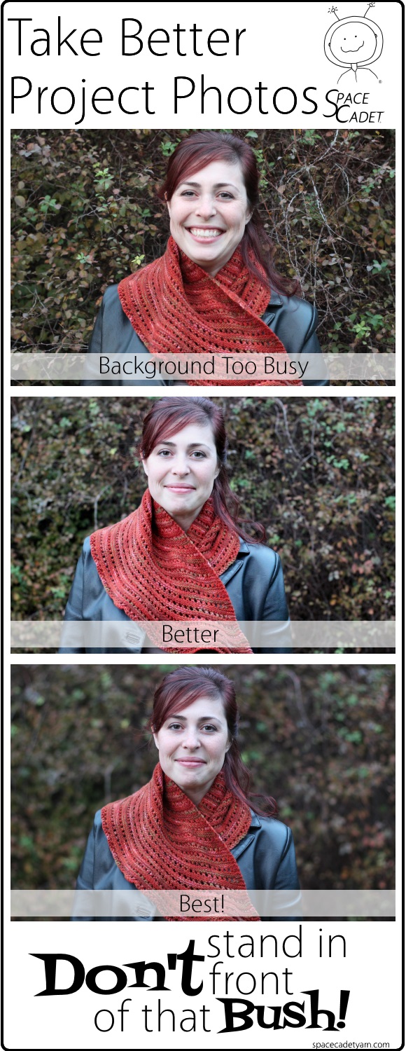
Here, look at the examples above. These are a few photos that my assistant Jade and I took today — nothing fancy, just grabbed the camera and snapped a few shots in the fading evening light, just the way you might at knit night. In the photo on top, I had her stand right in front of a bush so the leaves are in focus. See how the shawl really kind of disappears? In the middle image, I changed things so the bush was more out of focus, and the impact is obvious. And in the last shot, I really de-focused the bush — now your eyes are not distracted by those leaves at all, and all you see is smiling face and that gorgeous shawl (the Sick Day Shawl by Kate Atherley, which I knit in SpaceCadet Ceres yarn).
Big difference, isn’t it? Ok, so there’s step number 1: don’t stand in front of that bush!
Step Away from the Background
Even if you don’t choose a bush as your background (go you!), unless you’re standing in front of a professional photography backdrop, there may still to be small details that will draw your viewer’s eye away from your finished object. Notches in wood, nicks in plaster, or the pattern of a brick wall all compete for attention. Fortunately, there’s an incredibly simple solution: step away from the background. By stepping forward a few paces and setting your camera for a more shallow depth of field, you will blur that background a bit — and that is enough to draw the attention back to your intended subject.
Look at these photos below. In the one on top, the brick wall is a much simpler background than that bush she was in front of before, but it still really competes for your eye’s attention. In the image in the middle, I had Jade step forward about 5 paces, without changing anything else — see how she stands out more? And in the last image, I lowered the f-stop to blur the background more. Scroll up and compare it to the top image… wow, that’s quite a difference! Now she (and her lovely shawl) stand out a lot more, and your eye can easily tell what it’s supposed to be looking at.
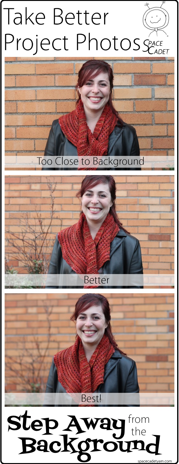
What is depth of field? It’s simply how deep an area of the image the camera is going keep in focus. The shallower the depth of field, the more the background will be blurred (and maybe the foreground too). How you achieve this depends on your camera. You’ll get the best results with a SLR, which allows you lower the f-stop to get a more blurred background — set it to aperture mode and play around a bit. With a point-and-shoot, you can get good results by setting your camera to portrait mode — look for the symbol of a head/face on your camera’s settings. And if you’re shooting with a smartphone, make sure the person taking the picture touches the screen to tell it the focus is on you (or your project) rather than the background. The combination of stepping away from the the background along with these quick setting changes will go a long way to making your project photos really pop.
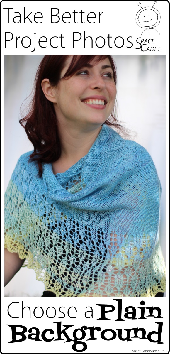
Whenever Possible, Go for a Plain Background
The need for all of the adjustments I’ve mentioned above can be lessened if you go for a plain background. The simpler it is, the less your eye will wander from the object you want to focus on — your gorgeous project. Here Jade is sitting in front of a very simple background — it’s not perfectly plain white, but there is nothing to distract you from the stunning shawl she’s wearing (it’s Eyeblink by Heidi Alander, which Jade knit in SpaceCadet Maia yarn)
Try a Dark Background
Most of the backgrounds people choose are either busy or light (or both). Busy is a problem, light is not, but sometimes a dark background can do really wonderful things for your project. Setting your project against a dark colour creates an amazing sense of intimacy that draws you right into the photo. So even though it might not be the first option you gravitate towards, don’t be afraid to try a darker background. Have a look at the way these projects pop…
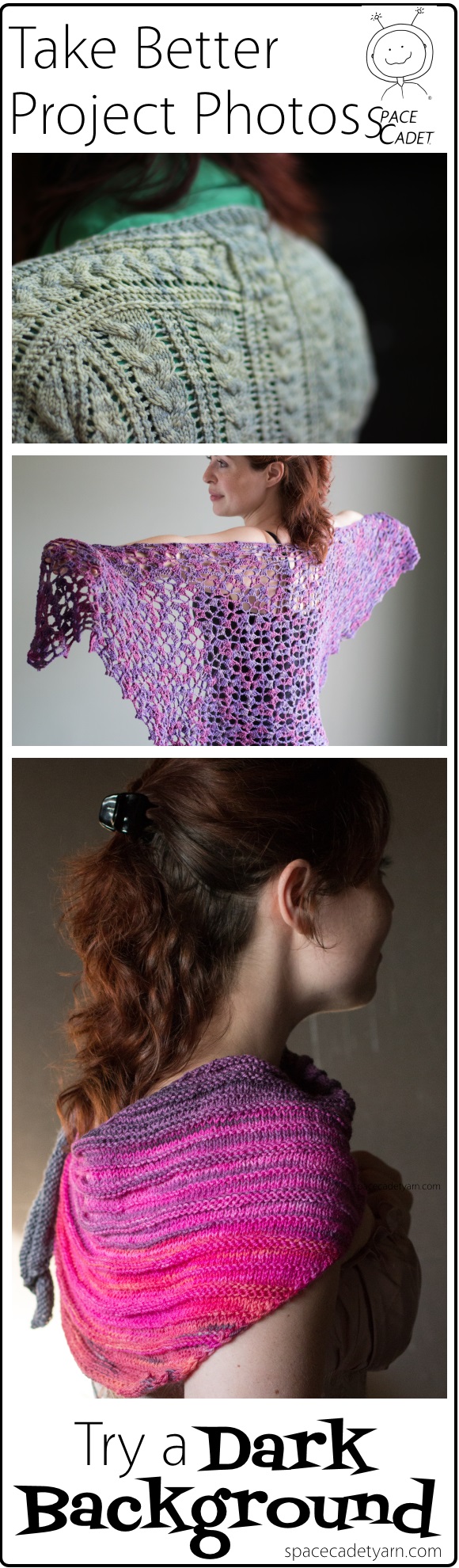
The first picture is Melissa Jean’s Dublin Tee in SpaceCadet Lyra yarn, and the photo was taken in full sun but against a black barn door — really beautiful. The second is Lindsey Stephens’s Drift Ice Shawl in SpaceCadet Oriana yarn, shot against a dark olive wall in the SpaceCadet studio. And the last image is the Quaker Yarn Stretcher by Susan Ashcroft, knit in SpaceCadet Ester yarn and photographed in… are you ready?… in my complete disaster of a garage! Jade was squeezed between old cans of paint and a broken television — but the light was just right and the background was so beautifully dark that the image becomes all about the gorgeous colour in the shawl.
So, you see? The simplest steps can make a huge impact on how your project stands out in your photos. Are you inspired to try some yourself? Grab your camera and do it! Then please, post your photos on Twitter or Instagram, using the hashtag #BetterProjectPhotos so I can find them. Or click here to share them on Ravelry. I can’t wait to see them!
This post is the first in a series on better project photography. Want to make sure you don’t miss any? Click here and get on the SpaceCadet mailing list!