Understanding Colour: Variegateds, from Gentle to Wild

Understanding Colour: Variegateds, from Gentle to Wild

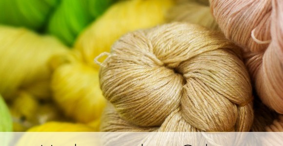
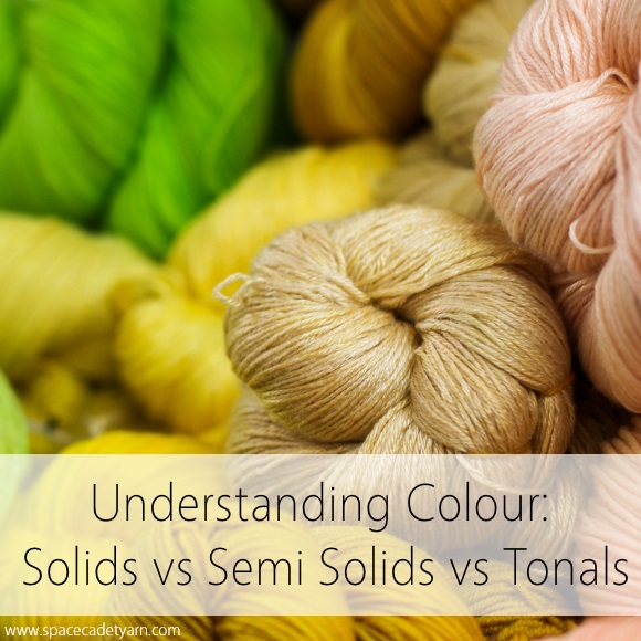
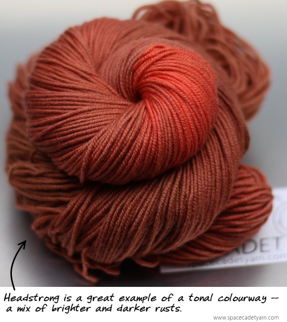
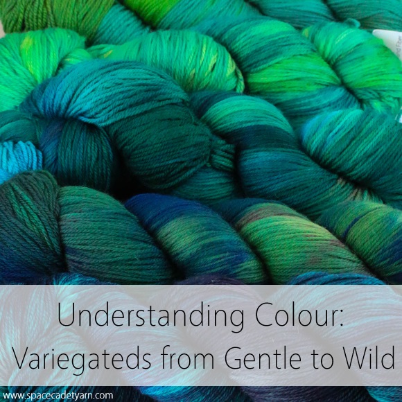
Last week we talked about the different meanings of the colour terms “solid”, “semi-solid”, and “tonal” — all of which refer to yarn dyed in a single hue.  But so often the yarns that really send our pulses racing are the multi-hued colourways — layer upon layer of fabulous colour, almost glowing in our hands as we turn them over and over to catch every last shade.  These are variegated colourways and, beautiful as they are, they can be intimidating.  But there are different types of variegateds and, once you realise the differences, they become much more approachable.

Understanding Colour -- Variegateds from Gentle to Wild

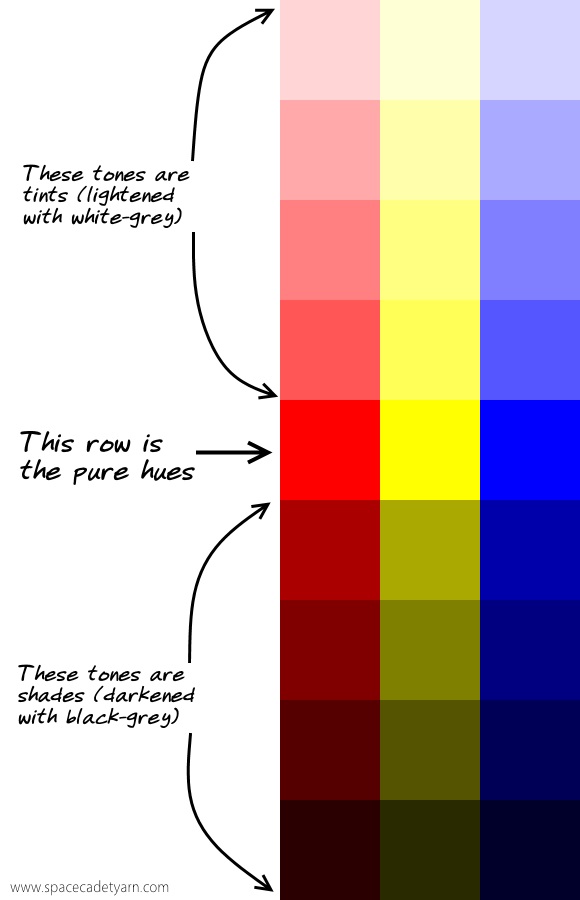
So first, let’s define what we’re talking about.  The straight-up definition of a variegated colourway is any colourway that contains more than one hue (colour). So, going back to last week’s post, if a yarn contains light kelly green and mid-kelly green and dark kelly green, it’s not variegated, it’s tonal because the hue of all the greens is the same.  But if a yarn contains a yellow-green and a blue-green as well as the kelly green, now it’s got mutiple hues (colours) and that makes it variegated.  To put it very simply: in a variegated colourway, the colour varies.

But there’s far more to “variegated” than just that simple definition.  Here at SpaceCadet, we tend to divide our variegateds into two categories: Gently Variegated and Wildly Variegated, and the good news is that they are exactly what they sound like.

Gently Variegateds: The Easy-to-Love Variegateds

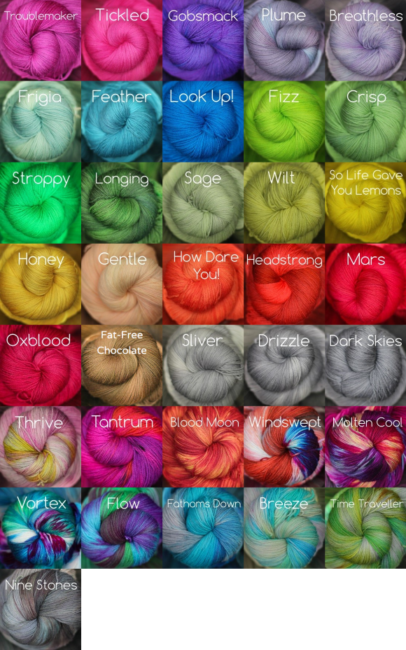
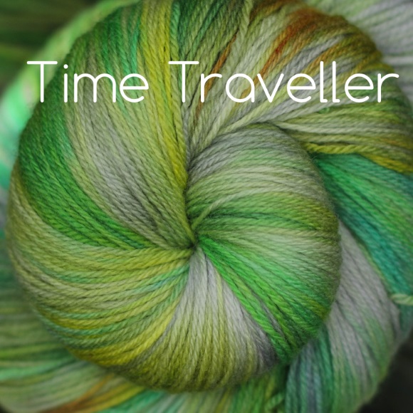
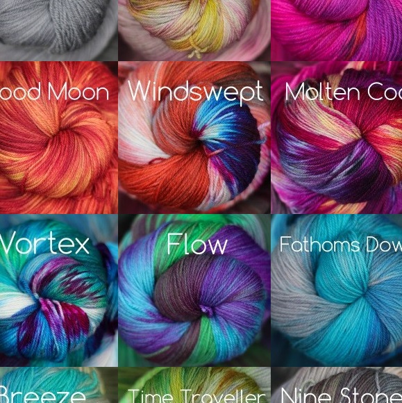
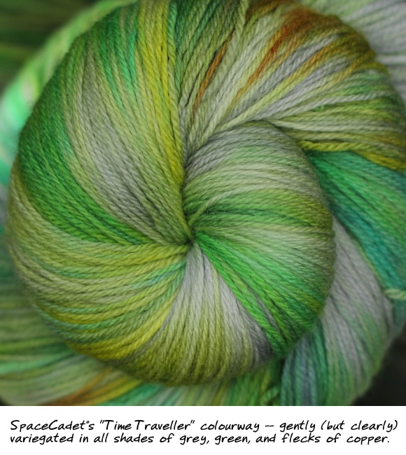
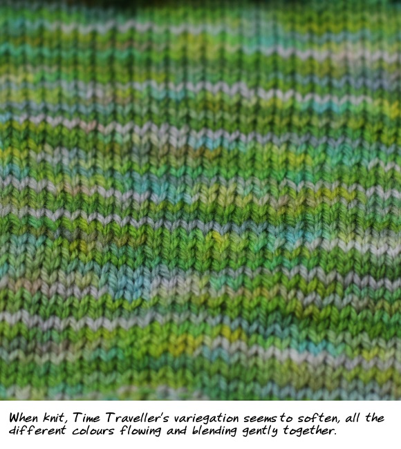
Gently Variegated colourways are low contrast — their colours blend and flow into one another.  Think of our colourway Time Traveller, all shades of green and gray and gentle flecks of copper.  There are actually a whole bunch of colours in there — it’s definitely variegated — but none of them are jarring against each other.  In fact, although the yarn looks clearly variegated in the skein, when you knit it up, it’s quite startling just how much the different colours begin to flow into each other.  In fact, if you back up a few feet, it all begins to blend together as if it were hardly variegated at all.

SpaceCadet's Time Traveller

SpaceCadet's Time Traveller Knitted

Wildly Variegateds: The Bad Boy Colourways You Can’t Help Falling For

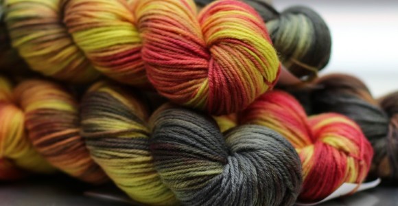
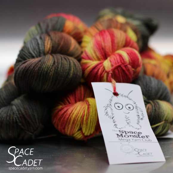
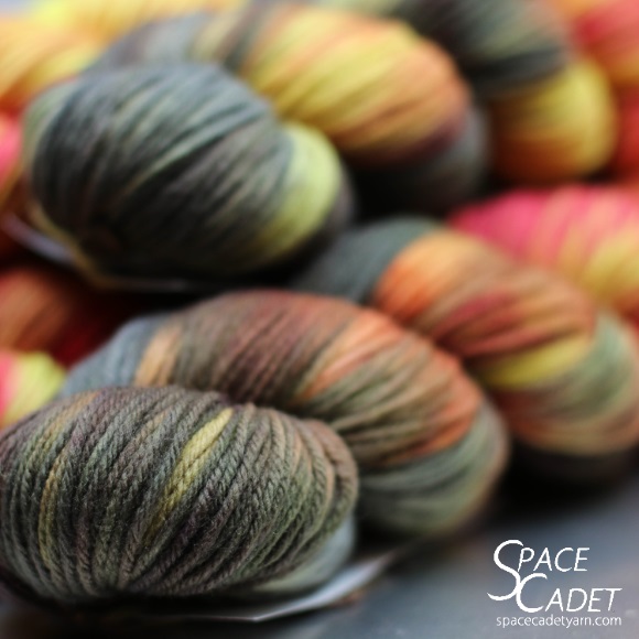
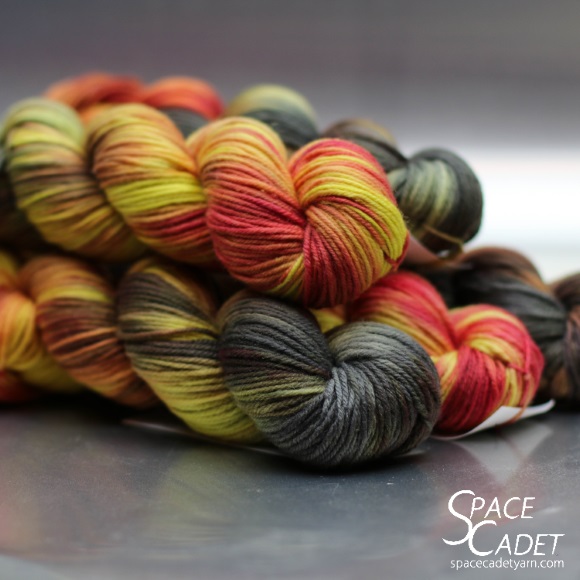
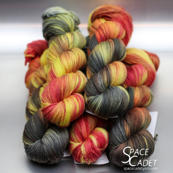
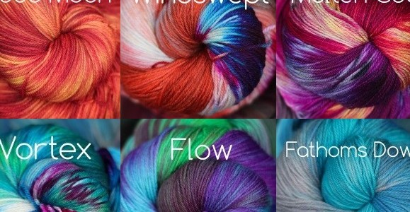
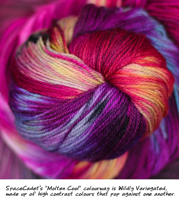
Wildly Variegated colourways are high contrast, containing hues that pop and sizzle against one another.  These are colours that jump around on the colour wheel, like the rust-and-blue combination in Windswept or the maroon-blue-yellow of Molten Cool. They’re incredibly exciting to knit or crochet with, the colours morphing and changing across your stitches.  But because they are high contrast, they can be high maintenance as well — there’s a push-pull element to the colours that means that, unlike Gently Variegateds, they may not play nicely together in plainer stitches.

SpaceCadet's Molten Cool

SpaceCadet's Molten Cool Knitted

So, so far, so simple.  Variegateds are colourways that contain more than one hue (colour).  Gently Variegateds are low contrast and Wildly Variegateds are high contrast.  Easy, right?  Yep, so let me complicated it just a bit.

When Gentles Go Wild (And Vice Versa)

There’s another element to what makes us perceive a variegated yarn as either Gentle or Wild, and this one defies the neat definitions we discussed above.  That element is the specific layouts of the colour repeats.  Or put more simply: how quickly and often the colour changes.

A yarn with long colour repeats will tend to look more variegated regardless of whether the hues are high or low contrast, simply because those long stretches allow the colours to separate in your knitting or crochet.  Depending on your project, they may stripe (or semi-stripe), pool, argyle, or create irregular flashes.  And when there are these sorts of large, distinct areas of a single hue which abut other distinct areas in a different hue, our eyes more easily perceive those colour changes and the colourway appears to have higher contrast (even when the two hues are similar).

And the reverse is true as well: when a yarn has many short colour repeats, it tends to look less variegated, regardless of whether its hues are high or low contrast.  Short, quick colour repeats create tiny pops of colour that sit right next each other in your knitting without such distinct edges.  Because of this, our eyes perceive even a wildly variegated colourway almost as a single, multi-hued colour (as if such a thing were possible) and the whole thing appears to be lower contrast.  Think of a heathered yarn, which may have anything from grays and browns to blues, greens, yellows, and perhaps even hot pinks — and yet, because the colour changes are many and often, they all blend together in a way that could almost be described as soft.

A Wildly Variegated colourway looks gentle thanks to short colour repeats

A Wildly Variegated colourway looks gentle thanks to short colour repeats (2)

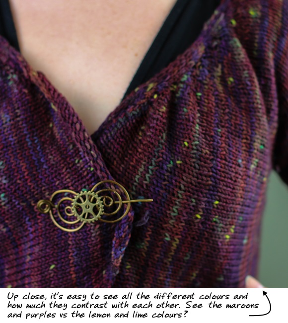
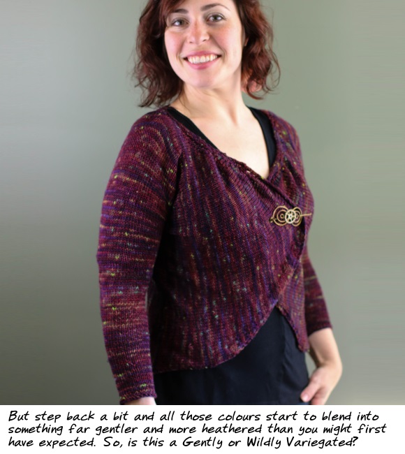
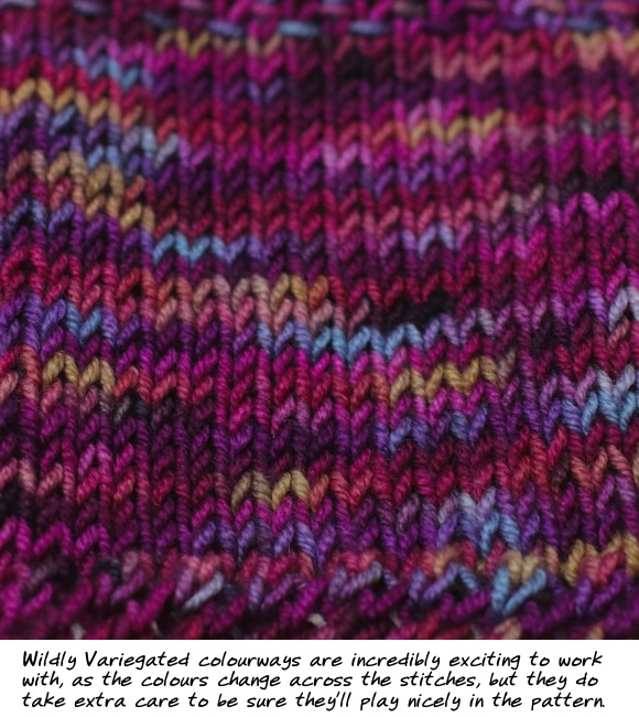
Here’s a great example:  this is Mythos by Laura Nelkin, which my assistant Jade knit in a one-of-a-kind colourway we created last year.  If you look closely, you can see that the colours are actually very high contrast — there are maroons, purple-blues, dusty aqua, lime green, and even yellow.  By definition, it’s a Wildly Variegated colourway (and kind of sounds like it should be approaching the dreaded clown barf).  But, in reality, the short repeats give only pops of colour instead of stripes or pooling.  And the result is a colourway that is Gently Variegated and almost heathered — proof that even high contrast colourways don’t have to be so wild after all.

Now It’s Your Turn…

So now that we’ve gone over the terms, here are two exercises to give you hands-on practice in understand these different types of variegateds:

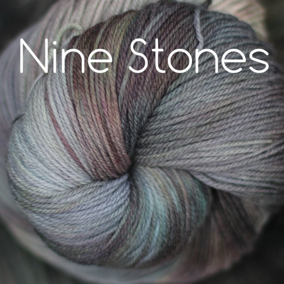
  • First, go to the SpaceCadet colourways page and scroll to the bottom to see our variegated colourways.  Mentally note which look Gentle and which look Wild to you, and then compare it what we consider Gentle or Wild by clicking on the buttons at the top (you’ll see them marked “Gently Variegated” or just “Variegated” — I left off the word Wild because I didn’t want to them to sound scary).  Remember that although there are clear definitions for both, there are no right or wrong answers — the perception of wild vs gentle is pretty subjective.  Even very high contrast colours can look Gentle if they are configured the right way; and low contrast colours can start to look a little Wild if they are allowed to pool, flash, or stripe.
  • And then, go and look at your own stash and see what you gravitate to.  Do you have a lot of yarns with colours that blend and flow into one another, or that are close on the colour wheel?  Or is your stash filled with yarns whose colours that contrast sharply with one another?  Open the skeins up to see how long the colour repeats are, and think about how is that going to affect the way the yarn looks when it’s knitted or crocheted.  Most importantly, how do you feel about the colourways in your stash?  Are you excited to work with them and see how they come out or are you a little intimidated by them?  Ultimately, whether Wild or Gentle, low contrast or high, the how we feel about the end result is what really matters.  But we’ll get better results from our yarn — and our yarn shopping — if we really understand what draws us to the yarns we love.

Next up in this series: a colourway that seemingly defies all these definitions… and what makes it so interesting.  I’ll be posting that sometime in the next week or so — don’t miss it!

Understanding Colour: Solids vs Semi Solids vs Tonals

Understanding Colour: Solids vs Semi Solids vs Tonals

An addiction to knitting and crocheting (raise your hand!) might seem like it’s all about the fiber, but it’s really as much about colour. And while lots of folks immediately get schooled up in yarn terms — fingering vs DK, wool vs acrylic, merino vs BFL — there’s a lot of confusion around colour. The terms can be muddling and matching up colourways to patterns can be downright perplexing. I can’t tell you the number of conversations I’ve had with customers at shows where we’re all using the same words (“semi-solid”, “variegated”, “tonal”…) but all at cross-purposes. And so today I start a series of posts to lift that confusion and explain colour terms for hand-dyed yarn.

Understanding Colour -- Solids vs Semi Solids vs Tonals


Ready to get started? First up, three words that sometimes get used interchangeably and sometimes to refer to completely different things: solids vs semi solids vs tonals. Here’s how we use them at SpaceCadet…


Solid Colours (and When a Solid is Not a Solid)


Solid colours are what commercial yarn companies create when they dye in a single hue. You look at a solid skein and you see one, even colour, without variation along the entire length of the yarn. And here’s the key about understanding a solid colour: in natural materials, it can only be achieved by dyeing the fibers before they are spun into yarn, which means it’s usually only larger commercial yarn companies that can create a true solid yarn.


Why? Because it’s the nature of dyeing that the colour is distributed unevenly in the dyebath — to varying degrees, of course. In some dyebaths it’s very obvious that the colour is uneven and in others barely perceptible, but it’s almost impossible to get dye 100%, totally and completely evenly distributed in the water — and therefore on the item being dyed. That means that there will be places where the dye adheres to the fibers more densely (eg, more intensely) than in others, and the result will look uneven.


Commercial solid yarns
But the big yarn companies are able to solve this problem by dyeing unspun fiber and then running it through huge blending machines and industrial carders before spinning it into the yarn. The process ensures that any uneven patches are redistributed and the resulting yarn is a beautifully even, solid colour. If you were to pick a commercial yarn apart and compare each individual fiber to another, you might be able to spot some variation, but the overall effect is a yarn in a solid colour.


Semi-Solid Colours (the Solids of the Indie Dyer’s World)
Semi-solid colours are, again, a single hue but this time showing off the natural variation that results from the unevenness of the dyebath. Semi-solids are what you get from hand-dyers — even when dyeing with a single hue, it’s almost impossible for an indie dyeing company to achieve a truly solid colour. Why? Because most indie dyers work with skeins that have been spun by a mill, which means they’re dyeing fiber that is already in yarn form and so, if the dye adheres to the yarn unevenly, there is no way to redistribute the colour to make it even.


And that’s the nature and the allure of hand-dyed yarn. Instead of looking for perfectly even colour, hand-dyed has intriguing depth and beautifully organic variation that makes each yarn truly one-of a kind. In a finished garment, semi-solids will look like a single colour from a distance, but reveal fascinating complexity up close.


Three Semi-Solids -- Tickled, Gobsmack, and Drizzle


Now, do I always faithfully refer to our yarns as “semi-solid”? No, I call them “solid” as often as not because, in regular conversation, it doesn’t make much difference. But if we’re being technical, as we are here, then all our single-colour skeins are semi-solids.


Tonals (and Here’s Where It Gets Tricky)


“Is this a tonal or a semi-solid?” is a question I get asked a lot. It’s often followed by, “Wait… what is a tonal exactly?” I’m not surprised, because the answer is a little technical, but let’s try to keep it simple here.


Headstrong -- a great tonal colourway


A colour tone is created by mixing a pure colour (a hue) with a grayscale colour in the range between black and white. So, if you have a pure green, and you mix it with black or an almost-black gray, you’ll get a darker version of that same green, which is called a “shade”. And if you take the pure green again and mix it with white or an almost-white gray, you’ll get a lighter version of that green, called a “tint”. In both cases, it’s still the same hue — the green isn’t any yellower or bluer — it’s just a darker or lighter. Together, the shades and tints (the darker and lighter versions) are the “tones”. Got it?


Tones -- pure hues, tints, and shades
So a tonal yarn is simply one that incorporates lighter and darker versions of the same colour in the one colourway. It doesn’t have any other hues — no yellower greens or bluer greens — just darker and lighter sections of the exact same colour.


Is that the same as a semi-solid? Well, in some ways, yes. At SpaceCadet, the yarn we dye starts out white(ish) so in those places where the dye doesn’t strike as intensely, what you’re getting is the colour mixed with the white of the yarn — which is a tint. But unless the undyed yarn also has naturally dark gray sections (and ours doesn’t), a typical semi-solid won’t contain any dark tones (shades). So the terms semi-solid and tonal are almost the same thing. Not quite but so close that, in day to day conversation, it probably doesn’t really matter — I tend to use them both without worrying.


Twisted and Tickled -- a good example of tone on tone


There you have it, three words that are often used interchangeably but actually have slightly different meanings. In day-to-day chit chat, the differences probably don’t matter much but, if you want to be as accurate and knowledgeable about the colour of your yarn as you are about its fiber content or construction, then it’s important to understand these details.


Now It’s Your Turn…
So now go and look at your stash — what have you actually got? Do you gravitate toward true solids or do you like the variation and intrigue of semi-solids? Can you find any true tonals, with both lighter and darker tones? Do you love the one-of-a-kind nature of hand-dyed semi-solids?


Up next in this series: understanding variegateds, from gentle to wild. I’ll be posting that sometime in the next week or so — don’t miss it!
Limited Editions: Gather Together

Limited Editions: Gather Together

Autumn is such a wonderful time of year – not just in the colours, but also in the smell in the air, the crisp coolness, the promise of family gatherings and the upcoming holidays.  And for a dyer, that’s a fantastic source of inspiration for warm and inviting colour-play.   Here, let me share how we interpreted that in our latest Limited Editions Collection, chosen directly from October’s Mini-Skein Club bundles.  But first, let me show you both colourway mixes….

The SpaceCadet Mini-Skein Club for October 2015


Limited Editions

Wouldn’t those Gradient Minis make a perfect Sweater Kit?  Oh yes they would!

Gather Together 1 580


As brightly coloured leaves fall and the air grows cooler, we Gather Together in the warmth of meals shared and autumn holidays, with family and friends and all the goodness the changing seasons bring.

This stunning set of colourways brings the amazing  colours of fall to your next project, flowing from maple reds and golds through to warm rusts and russets, and highlighted with even a touch of purple. Watch the intriguing colour change play across your stitches. And then — because this is a SpaceCadet Start Anywhere™ Kit — the colours of the last skein flow back again into the first!

(Where’s the order button? This kit is exclusive to October Mini-Skein Club members. If that’s you, look for an email arriving shortly with your members-only link!)


If you’re not in the Mini-Skein Club, don’t worry, we’ve got an amazing colourway for you from our Multicolour bundle.

Twirl 2 580

Set against graphic gray and white, the zing of magenta is a bold addition that makes Twirl stand out.

Available on three bases, until November 21 only

Click to order


Bless 1 580

The sweetest shade of bubblegum pink, Bless Your Heart! is offset by warming streaks of gold.

(Where’s the order button? This colourway is exclusive to October Mini-Skein Club members. If that’s you, look for an email arriving shortly with your members-only link!)


Thankful 3 580

Thankful’s warm and spicy yellows and russets conjure up abundant harvests and happy autumn gatherings.

Available on three bases, until November 21 only

Click to order


Quick Escape 4 580

Sometimes you just have to get away, and the maple reds, spiced yellows, and deep purples of this colourway will give you that Quick Escape you crave.

 (Where’s the order button? This colourway is exclusive to October Mini-Skein Club members. If that’s you, look for an email arriving shortly with your members-only link!)


Want Alllll These Colourways?

Our Mini-Skein Club Members get access to all these colourways so, if you’re not in the club, you’re missing out! And not just on the full-skeins here but on all the wonderful bundles of yarny goodness we deliver to your door every month. The Mini-Skein Club is where we really explore colour, letting our imaginations run wild to create ten new colourways each and every month — and our club members get to join in on all that fun, diving right into the colours and trying all of SpaceCadet’s fingering yarns along the way. Click here to join us!

The Surprising Way your Screen Affects SpaceCadet Yarn

The Surprising Way your Screen Affects SpaceCadet Yarn

I’ve been doing some work on the SpaceCadet website* and I’ve noticed something that surprised me so much that I just have to stop everything right this minute to share it with you: what you see on your screen may not be what our yarn actually looks like.  In fact, your computer or mobile device may be deceiving you.

We all know that different computer monitors display things slightly differently. Each monitor has its own settings that can be adjusted to either the manufacturer’s presets or to your own liking, and those adjustments impact the way images — and, more crucially, colours — appear on the screen. That’s the reason we mention on each yarn’s sales page to “…please remember that our photos are as accurate as possible, but the colours you see also depend on your computer monitor’s settings.” But I also know how easy it is to skip the small print when the page is filled with pictures of delicious yarn.

How Your Monitor Shows Colours is Critical When Buying Yarn!

But I got a reminder about how import that little detail is while I was working on the website. We’ve been working hard this year to expand and revamp our palette of colourways, and I was adding a section to the front page that looks like this:

Laptop Screenshot 2015-11-02 23.34.35

As I was making changes, I’d check the website on my computer (a desktop pc) to make sure the changes were coming out right. Another adjustment, another check… another adjustment, another check… As it began to come together, I was getting super excited about the results. And then, I checking on my iPhone, and I was kind of shocked by what I saw!

Better Pictures May Mean Disappointing Yarn…

Everyone knows that Apple is all about the visuals: retina screens and vibrant images, with colours so intense they jump right out of the monitor. And that’s great when you’re looking at your vacation photos — you’ve never taken such amazing shots! — but it may not be the best thing when you’re trying to buy yarn. Here at SpaceCadet, we are essentially in the business of selling colour over the internet, and so to make sure our customers get what they order, our images need to represent our colours as accurately as possible. With that in mind, check out how that same webpage section looks on my iPad:

iPad screenshot

It aligns itself a little differently on a mobile device but, don’t worry, it’s the same spot on the website. But here’s the important thing: take a look at how differently the colours come across on the iPad — how much more intense and vibrant. Do you see Frigia, that very pale blue? On my desktop, it’s true to the actual colour — a very pale and sublime icy blue. But on my iPad, it appears to be a much more intense blue, more intense than the yarn truly is.   And the iPad image actually has a greenish tinge — look at the edges of the yarn and you’ll see what I mean — that isn’t there at all in the actual yarn.  Here, it’s easier to see if I put them side-by-side.

Side by side comparison, desktop to iPad

And while you’re looking, check out the two greens in the row below the blue. See how completely different they look on the iPad vs the pc? Now, full disclosure: because the difference is in each devices’ screen and not in the image data itself, I had to adjust the iPad image in Lightroom to accurately reflect here how different they look in real life. But I worked very hard to get the images true and you can easily test it live for yourself: if your computer and phone are manufactured by different companies, just click here on both your phone and your desktop/laptop to bring up our colourways page and then compare what you see on the two devices (note that if both your phone and computer are Apple, you probably won’t see the difference, and I haven’t yet tested this on non-Apple phones).

The pictures here can’t really do it justice, but when I held my phone up and showed that live side-by-side comparison to my assistant, she actually gasped. “That green is glowing! Like it’s… like it’s radioactive or something!”  She was talking about the colourway Stroppy — take a look at your devices side-by-side and you’ll see she’s right. I don’t think we could achieve that kind of a glow in real life without dropping some plutonium in the dyebath! And, again, if you look at Frigia and Feather, there is that slight yellow cast giving them both a green tinge that they simply don’t have.

Ok, So What Do We Do?

So ok, you can see what an impact different screens make to how our colours appear, but the big question is, what do we do when our customers are shopping for yarn online and their devices are representing our colours in these different ways? In all honesty, I’m not sure. I think that all I can do is continue to take pictures that are as true to our real-life colours as I possibly can, and then to share this information with you so you are aware.  And it’s not just the SpaceCadet website that is affected, of course — it’s every website you visit on a device that intensifies colours.  Yes, your vacation snaps suddenly look amazing, but when you’re shopping for yarn on our site or another dyer’s site, when you’re looking at clothes or housewares online, or when you’re choosing paint or fabric, just bear in mind that those incredible colours may not be all that true to real life.

And if what you’re looking for is radioactive yarn and you think you might’ve found it, well…  I may have to disappoint you. But if you’re looking for a colour that will make you gasp — and in a really good way this time — we can certainly help you out!

SpaceCadet Colourways

Hey, if you think this screen-settings issue is one your knitting and fiber friends should know about, please share this post on Facebook (click here) and Twitter (click here) and Ravelry.


*Please check out the front page and tell me what you think. Does it look good on your device? Is it easy to find your way around? I’ve worked really hard on it and I’d love your thoughts. Just email missioncontrol(at)spacecadetyarn(dot)com and let me know — seriously, I’d be so grateful for your feedback.


Get Our FREE eBook!The Folks on our Mailing List get More!

If you found this post useful, you’ll want to get on our mailing list. Each week(ish) we send out a newsletter packed with all the latest that’s happening in the world of yarn, plus pattern picks, our pop-quiz, and more! And, when you join the list, you…

Get Our FREE eBook with Great Tips & Hacks from the Top Indie Designers!


Share your Project Idea to Win Free Shipping!

Share your Project Idea to Win Free Shipping!

You know, they say the best stuff comes in packages with free shipping.  Wait… no they don’t.  But still, free shipping has to make any package way better, right?  And when we’re giving away free shipping in a way that’s also some seriously sweet eye-candy and a ton of fun to enter…  well, you just can’t beat that!

But first, let me show you the SpaceMonster Mega Yarn Club’s October colourway…

Long Shadows 5 580


From the SpaceCadet’s Log:

A few weeks ago, I was driving along a quiet country road which twisted past a field of tall grasses yellowing in the sun and ducked in and out beneath trees that were still mostly green. From all appearances, summer was holding on strong but somehow I could feel autumn marching relentlessly nearer. What was it that gave the game away? The shadows. They fell in gray streaks that stretched long and thin from the base of each tree across the road and far into the field, and left me in no doubt that the sun was shifting its path across the sky, lowering its arc a little more each day, and letting the warmth of summer slip slowly away.

To capture the essence of these Long Shadows, we started with a buttery golden yellow – the colour of a hazy late-summer sunset, of weary grasses in untended fields, of leaves just turning. And over that, we layered soft grays that streak up and over the yarn, fading in and out from strand to strand. And then we finished it with glazes of rust, russets, and deep maple reds, to pull in some of the hues of the glorious season to come. The result is a colourway that I hope captures all the depth of autumn’s change, from the bold to the melancholy, in a yarn that will work up in gentle undulations from shade to shade.

Long Shadows 3 580

Isn’t it lovely?  Dyed with very short colour repeats that are designed to create a painterly effect in the final fabric, this is a colourway that will blend together at a distance but be full of intrigue up close.  I love that kind of yarn — so interesting from stitch to stitch, but with colours that flow gently and work beautifully in the final fabric.

Long Shadows 4 580

But enough about that — let’s talk about that free shipping…

How to Enter to Win Free Shipping

We’re looking for project ideas for this colourway — share your idea to get entered to win!  Here’s how:

  • Everyone can enter, whether you’re in the SpaceMonster club or not, and you can enter as many times as you like.
  • To enter, just click here and post a pattern idea (including a picture and link) in the thread.  That’s all there is to it!
  • Each separate post (with picture & link) counts as a separate valid entry so the more pattern-idea posts you create, the better your chances of winning!

The sweepstakes is open until the end to the month, and closes at 11:59pm EST on Oct 31. For full sweepstakes rules and alternative method of entry, click here.

Long Shadows 2 580

The SpaceMonster Mega Yarn Club opens for subscriptions in December (and makes a perfect holiday gift).  If you’d like to get on the mailing list so you’re the first to know when it opens, click here.

SpaceMonster click here


The Moment When My Creativity Disappears

The Moment When My Creativity Disappears

I’ve said many times that I like to approach dyeing as an exploration of colour, and when I stand in front of the dyepots and start mixing colours, I sometimes have so many ideas that my hands can’t keep up.  But when that yarn is all dyed and dried, that’s when my creativity seems to disappear on me, because I think that choosing a name for new colourways is the hardest part of all.

Seriously, so hard.

So sometimes, I turn to you guys and the response is always amazing.  I ask on social media for help with names and the ideas come flooding in!  I don’t always go with any one suggestion specifically, but they always push me onward and get my brain moving again.  And that is exactly what happened with both of these colourways.  I had an inkling of a name but couldn’t quite get there…  and then I asked for help and your ideas were what got my mind into focus, and ultimately brought me to two colourway names that are particularly personal and meaningful to me.  Want to see what I chose?


Time Traveller Celeste 580

Time Traveller

When I dyed this colourway — all muted greens and grays, highlighted with dusky golds — my mind kept turning to Salisbury Plain, the high chalk plateau that is home to countless prehistoric monuments, and which was only a stone’s throw from my home in Dorset.  I used to go across it every week, slowing to look at Stonehenge in the morning light, in the setting sun, on cold winter’s days, or warm summer evenings.  In the winter and that far north, the sun rises late and sets early, and I often drove past Stonehenge in the dark of night, searching for the silhouette of the stones in the moonlight.

And Salisbury Plain is the ever present backdrop, a quiet tapestry of gray skies and weathered grasses buffeted in the constant wind, of pale golds and wilted greens — the ancient home of stargazers for thousands of years.  And now also, a place for time-travellers, those who wander across the Plain in search of those same views, and those same stars, four thousand years on.


Nine Stones Celeste 580

Nine Stones

For this colourway, I knew I wanted to capture the magical multi-tonal quality of old stone — layers of soft gray, weathered brown, and a hint of palest blue that seem to have come together organically over many long years.   And it’s named for one of my favourite stone circles, not far from where I lived in England and tucked down a country road with hardly any fanfare to alert a passer-by that the stones are there.
They may have once stood proud in the sun, but now the Nine Stones circle is tucked away amongst trees, moss-covered and eroded by rains across millennia, too shaded now to ever track the stars.  But standing amongst the stones, in the dappled sunlight and the heady smell of wildflowers, I find the circle feels quiet and intimate and… almost gentle in a way that Stonehenge never will.  But the heathered colours of the weathered surfaces of the stones tell a history just as ancient.
New Variegated Colourways

We’ve got eleven stunning new variegated colourways — including Time Traveller and Nine Stones — to share with you!  Want to see the others?  Just click here to go the colourways page and scroll down to the very bottom.
SpaceCadet Variegated Colourways