From Skein to Swatch: How a Variegated Colourway Changes

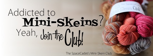
I was chatting with my assistant Jade last week about the process of turning full-sized skeins into Mini-Skeins, and she commented that she had been really surprised by how much a variegated colourway could change when the skein was rewound into mini size.  And of course they don’t actually change but, the thing is, breaking the larger skeins down into mini-skeins redistributes the colours, mixes them up, so our minds perceive that the skein has changed colour.  And that has a big impact not only on the skein itself, but what you eventually make with it.  Jade wrote a post about it in the SpaceCadet Ravelry group and it was so interesting, I thought I’d share it here too.

Spoiler Alert: March Mini-Skeins

Now, before we move onto Jade’s post, let me warn you that it does contain images of one of March’s Mini-Skein colourways.  If you’re in the club and you want to be surprised when your bundle arrives, don’t scroll any farther.  But DO save this post to read later — it’s a really interesting topic.  Ok, now, let’s turn it over to Jade…

Stephanie and I have been talking about exciting new things for Mini-Skein Club members, and an offshoot of that discussion revolved around how different full skeins and mini skeins look.  Until I started really working with yarn (not just knitting, but seeing the whole process from dyeing to twisting, and especially making Mini-Skeins), I noticed but didn’t understand why the colors of the variegated yarns I loved never quite came out the way I thought they would.

I’d see lovely patches of color, and it would knit up as stripes. Pretty, but where were those beautiful pools? Or, I’d see yarn that looked like a soft, even blend of colors and, out of nowhere, there were the pools, but not where I wanted them. It was a mystery, and I wondered how the same skein managed to look so different.

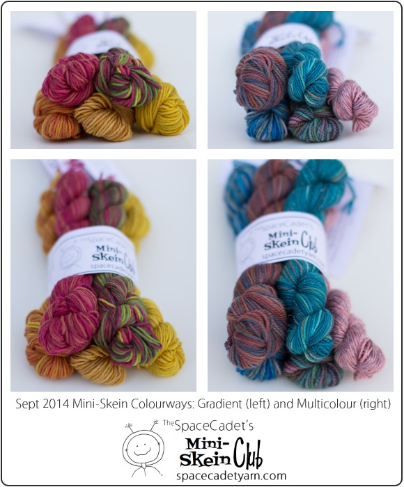
Here’s where the spoiler alert comes in: One of the March Gradient skeins illustrates this perfectly, and I just had to show you. So, consider this a sneak peek at this month’s Minis…

One Skein, Three Ways

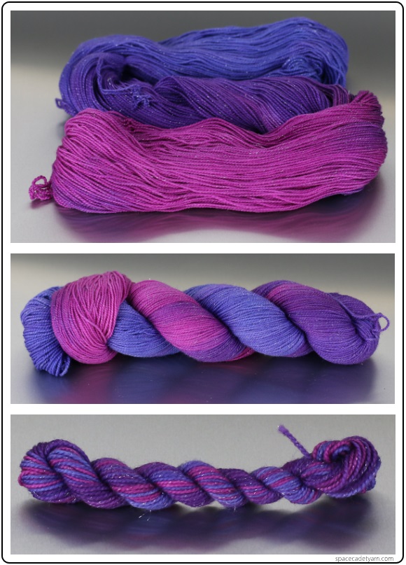
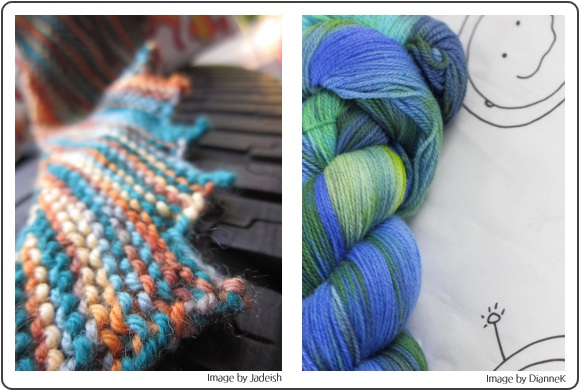
In the pictures above, you can see the whole skein loose at the top, another skein of the same color that’s been twisted in the middle, and (still) the same color re-skeined as a mini.  Each looks so different!

The loose skein at the top looks like two colors flowing evenly into each other. Twisting that skein makes the colors pool into beautiful bands, and the gradient effect is hidden. And in the mini skein, the colors are redistributed so that the skein almost looks striped (which is a big clue as to how it’s might knit up).

And, here’s how this color looks knitted in a swatch:

The Same Skein Knitted Up

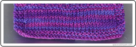
At this size (28 sts of stockinette with a 2 st garter border), it’s very nearly self-striping. From the whole skein, it looks like it should have been a smooth transition from blue-purple to deep pink, while the twisted skein made it look like it would have pools of purple, blue, and pink. Instead, the mini skein gave the best preview: nearly striped.

The things you learn when you start learning to dye yarn and make mini-skeins…!

So How Does a Variegated Skein Work Up?

This is a question we get asked all the time.  A customer will pick up a skein of beautiful, variegated yarn at a show and say to me, “Now, how will this look when I knit it?”  It’s an easy question to ask, but it’s got a far more complicated answer than you might think.

The reason is that there is no one way that a variegated yarn will work up in a project.  Just as that same skein looked completely different loose, twisted, and reskeined (as in the three pictures above), so it will look completely different again depending on whether you knit or crochet with it;  whether you choose plain stockinette, garter, slipped stitches, or openwork; whether you work a small circumference in the round or cast on a huge piece on straight needles.  All of those factors (and more) will impact where and how the colours will move on your fabric.  So it’s next to impossible for me to look at the skein in your hands and easily answer question.

But the good news? With a little forethought, you are in complete control of the colours!

The Impact of Different Stitch Types

Let me demonstrate.  After Jade knit that initial inch or so of stockinette, I asked her change it up a bit, to do some different types of stitches.

The Impact of Different Stitches on Variegated Yarn

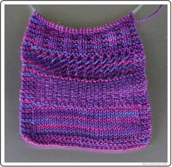
You can see from the picture above that, after the stockinette at the bottom, she moved on to slipped stitches, then a simple yarn-over lace, and finally, a 2×2 rib at the top.  And what do we see?

First, the striping that was so evident in the plain stockette almost completely disappears in the slipped stitch section.  Moving the yarn out of the straight back-and-forth rhythm blends the colours much more evenly, so that almost every stitch appears to be a different colour to its neighbour.  And if you knit a whole sweater that way, the overall visual impact would be of a fabric that appears to be a single colour.

In the yarn-over section above that, we see that the colourway’s appearance has changed yet again.  The stretched out stitches act to highlight the individual hues of the variegated yarn, giving each one a solo moment in the spotlight.  And even more interestingly, there’s even a kind of very subtle pooling happening on the left, where all the purple stitches have joined together.  Beautiful!

Finally, we have the rib stitch at the top.  Like the stockinette, rib is primarily a side-to-side stitch, so there is striping but this time it’s broken up — and made more subtle — by the stitch texture.  Showing that even a very simple stitch pattern can have a big impact on the look of a variegated yarn.

But How Do You Know?!?

There are many more ways that your choices can impact the way your yarn colour will behave. Be it your choice to knit or crochet, your pattern selection, stitch type, needle size, or any number of other things, one skein of variegated yarn can come out looking incredibly different depending on what you choose to do with it.

But how do you know?  Well, I have great news: there are ways to decode an untwisted skein just by looking at it, so that you can accurately predict how it will behave and which choices will bring out its beauty best.  And I’m going to be putting together a series of blog posts (and perhaps some videos) to help walk you thought that process.  They’ll be coming in the next few months, so click here to get on the mailing list and make sure you don’t miss them!

But That Won’t Be Until…

…until after these great Spring Events that we’ve got coming up!

Fri March 13 — The SpaceCadet’s InterStellar Yarn Alliance opens for Subscriptions!
The InterStellar Yarn Alliance is the SpaceCadet’s premiere yarn club, known for its amazing colourways and fantastic gifts. It’s open for subscriptions twice a year for two weeks only — from March 13 to 29 — and spaces always go fast. Set your alarm and then click here to grab your spot first!

Sun March 22 — HomeSpun Yarn Party, Savage MD
Possibly our favourite-est yarn show of the year, this super-fast, super-furious event is always pure crazy and intense fun for anyone who craves hand-dyed and hand-made yarny goodness. A one day show that features only small and indie makers, it’s so worth the trip to the beautiful Savage Mill — if you live in the DC-Baltimore area, please come and see us!

HomeSpun Yarn Party

Sunday, March 22 from 12-5pm
Historic Savage Mill 8600 Foundry Street, Savage, MD 20763 Just off I-95, plenty of parking!
Admission is FREE!

Fri-Sun March 27-29 — Pittsburgh Knit & Crochet Festival, Pittsburgh PA
Our hometown festival just gets better and better each year! Having rapidly outgrown all its previous venues, we are super excited that this year’s festival will be at the Westin Convention Center hotel in downtown Pittsburgh. Three glorious days of yarn and fiber fun, plus we are thrilled to be hosting festival headliner Alasdair Post-Quinn (author of “Extreme Double Knitting” from Coop Press) for book-signings in our booth. If you’re in the western PA area, we’d love to see you!

The Pittsburgh Knit & Crochet Festival

Fri-Sun, March 27-29
Westin Convention Center hotel, next to the David L. Lawrence Convention Center in downtown Pittsburgh

My Three Top Tools for taking Better Project Photos (plus 50% off!)

Back before the holidays, you may remember that I wrote a series of blog posts sharing some ideas and tips to improve your project photography (if you haven’t read them yet, check them out here, here, and here).  Then the holidays hit and…  well, here we are in February and I’ve still got one last juicy post to share with you.  And this one is loads of fun because it’s all about shiny new tools that you can start using right now.

The SpaceCadet's Three Top Tools for taking Better Project Photos


Tool #1: Take the Best Selfie Project Shots with CamMe

Just like the previous photography posts, let’s start with one of my pet peeves:  there you are in the photo you just posted on Ravelry to show off your fabulous new hand-knit sweater — it’s gorgeous, every stitch is perfect, you are so proud — and right there just behind your smiling face and fabulous sweater is…  your toilet.  Or your unmade bed.  Maybe even with a pair of dirty socks in the corner.  Ohhhh noooo…

Because, of course, to get a good shot of your sweater, you have to take the picture in a mirror, and most people’s mirrors are in either their bathrooms or bedrooms, so that background is pretty unavoidable.  I’ve seen countless images like this on Ravelry and, while I totally understand, it just never makes that finished object look as good as it should.

But there’s an app for that and it solves the problem so well (and is so much fun!) that you’re going to be stunned you haven’t been using it all along.  With CamMe, you set your iPhone at a distance and then hold up a hand to tell it that you want it to take a selfie.  When it sees your hand signal, it gives you a three second countdown and snaps a picture — setting you free to take finished object selfies anywhere!  Try it next to a sunny window in your house, or outside in the dappled shade of a tree.  Get adventurous and set it up on a shelf in the library while you leaf through a book, or prop it up in a shop window and snap yourself walking down the sidewalk in your lovely new sweater.

Sounds kind of amazing, right?  It is!  Here, check out their awesome little video showing exactly how it works:

CamMe video still
If you can’t see the embedded video, just click here

Best of all?  It’s FREE!

(Also, while I think this app is perfect for the knitting and crochet community — exactly what we need to show off our projects ourselves — I don’t think the folks at CamMe have realised that at all.  It’s is available only for iPhones, but if a bunch of us contacted the company to tell them we need it for other phones too, we might be able to wake them up to a whole community of customers they never even knew were there.  Click here to send them a quick message.)


Tool #2: Make your Images Gorgeous with Snapseed

When it comes to quick, on-the-go photo editing, I really don’t think you can beat Snapseed.  I know other apps have filters and editing options, but Snapseed’s controls go deeper than anything I’ve seen in its price range.   The cropping is more advanced, the colour correction is more precise and, together with all the other tools in its arsenal, I am able to take the most hastily-snapped phone images and turn them into something really spectacular.  I often even use it before I upload a photo to Instagram — it’s just too powerful to ignore.

Snapseed


Use Snapseed to crop your project photos right in to the most important details.  Adust the Saturation and Ambiance to get the colour just right (look under “Tune Image”) .  Or change the Structure and Sharpening options (under “Details”) to really bring out your stitchwork.   You’ll be blown away by how stunning your project photos become!

Oh, and what is its price range?  Well, that’d be…  free.  Plus, it’s available for both iPhone and Android.  Brilliant!


Tool #3: Learn from a Pro

Craftsy

I think the one thing I did that improved my photography the most was to take Caro Sheridan’s fantastic class on Craftsy, “Shoot It!“.  Caro is a professional photographer (you’ve seen her work allll over Ravelry, snapping for some of the biggest designers out there), knitter, sewist, and the co-author of Knitting It Old School, a collection of designs inspired by the 40s, 50s, 60, and 70s.

And why is Shoot It! fantastic?  Because it’s a photography class that is designed entirely around photographing knit and crocheted finished objects.  Seriously.  There’s no taking photos of food, or jewelry, or kids, or pets…  This class is all about the fiber arts and only about the fiber arts.  What could be more perfect?!?

Caro Sheridan

Caro walks you through everything you need to know to make your projects look stunning on Ravelry: how to frame your photos, how capture project details, how to work with a model.  She covers the best backgrounds, great tips for editing, how to put your model (and yourself) at ease during a shoot …and, if my memory serves, she even dips into choosing the right underwear (it’s important, people!).  Taking Shoot It! opened my eyes to a ton of easy fixes I could make to the way I took photos and I was amazed by how quickly my photography improved.

BONUS: Get Shoot It! for 50% Off!

Now, this is something just fantastic…  When I told Caro I was going to feature her Craftsy class on the blog, she graciously offered to give all of you 50% off the regular price of Shoot It!  Just click here to go to the class page, and you’ll see the discount is automatically applied.  Isn’t that just terrific of her?!?  So go on, take her up on the offer — your finished objects will thank you!

Caro Sheridan shooting


The #1 Tip for Better Project Photos

In my last two posts about taking better project photography, we discussed the impact the background can make (and it can make a big difference — if you haven’t read those posts, click here and here).  But in this post, I’m going to give you the one tip that — hands down — goes the furthest to making your project images look spectacular.

No 1 Tip for Taking Better Project Photos

Shoot Across Your Project

Ok, what do I mean by that?  Well, first of all, we’re talking about detail shots here, things that are close up, and not overall portraits.  So, this is when you’re trying to capture the details of the stitchwork, the edging, or the flecks of colour in the yarn.

You could photograph any of these by holding your camera head-on to your project and just taking a picture but, even if you come in close, that image is going to end up looking flat and…  well, kind of boring.  Look at this picture of my Leftie, knit in Oriana in Sliver and a set of SpaceCadet Mini-Skeins.  The picture looks nice enough but… well, just that: nice enough.

Flat Photos Can be a bit Meh


But then I took another photo of it and, this time, instead of hold my camera straight on so the project was flat to the camera, I got down low and took the shot across my knitting.  See how different this image feels?  Don’t you feel like you’re right there next to shawl?  Almost as if you’re somehow falling into the picture?  Even though this isn’t a very good image (I took under heavy cloud cover just as the sky was about to dump a bunch of snow on us), changing my angle and shooting across my Leftie really brings the project to life.

Shoot Across your project

The Rules for Shooting Low and Close

So far, so simple, but there are a tips that will help ensure your low and close images come out as amazing as you hope they will.

Tip #1 — Use Your Macro Setting

If you’re using a regular camera, be it a point-and-shoot or a DSLR, you’ll most likely have a macro setting (look for a little flower icon on your setting selector).  Choosing this will allow your camera to focus in much closer than your other settings, to really pick up the smallest details.  And it will blur out the background, to help the viewer’s eye to gravitate to exactly the details you want them to spot first.

Use your macro setting

If you’re using a phone-camera, it can be a little more complicated, because there’s usually no built-in macro setting.  But you’ll get the best results if you remember to keep your camera low to the object you’re photographing, shoot across your project rather than directly at it and, most importantly, remember to touch the screen to tell the camera exactly where you want it to focus.  Doing those things will go a long way to getting a macro-like image.


Tip #2 — Get Down, Baby!

Really, seriously, there is no substitute for this.  Whether your object is on a table or on the floor, get down to that same level so you can truly shoot across it.  Most likely you will not look elegant doing it — I swear my neighbours must think I have a foot fetish for how often I’ve been flat to the ground taking close-ups of socks — but your pictures will look so much better for your potentially ungainly efforts!

Look at this image of Laura Nelkin’s Ribband bracelet, for instance.  It wouldn’t have looked nearly as good if I’d shot it from standing, looking down and having the ground and pair of feet for a background.  Instead, by getting right down, I was able to catch the light in the beads, and create that falling-into-the-picture feeling again.

Get down


Tip #3 — Use a Never-Ending Backdrop

When you are down low to take pictures across your project, your camera is going to capture not only what your project is sitting on but also whatever is behind it.  There are a lot of backgrounds that can look really wonderful when they are blurred out by a macro lens but, if you want to keep it simple, just choose a never-ending backdrop.

What do I mean by “never-ending”?  It’s the background you always see models standing on in magazines, where it’s one continuous colour and you can’t tell where the “floor” ends and the “wall” begins.  It looks really fancy, but it couldn’t be easier to create for your knitting or crochet projects…  just grab a 75¢ piece of posterboard and prop it up against a wall.  Now when you get down low to take your photo, the camera will capture the posterboard running under your project and seamlessly up behind it as well.  There will be nothing to distract the viewer’s eye and so all the focus will be on your beautiful project.

Create a Never-Ending Backdrop

Now It’s Your Turn!

So there you have it — a very simple tip that can vastly improve the look of your project photos.  And now it’s over to you: grab your camera and your most recent project and experiment with shooting images at different angles.  And before you know it, you’ll be changing your photos from something “good enough” to something smashing.  Check out the difference in my photos of Kate Atherley’s Sick Day Shawl

Shoot Across your project 2b

And hey, when you do grab your camera and start playing, please come over to the SpaceCadet group on Ravelry and share those images with us.  We’d love to see how your photography changes when you get down with your project!

Better Project Photos: Backgrounds for Detail Shots

In my previous post, I shared some great ideas for improving your project portraits by choosing backgrounds that really make your finished object shine.  If you haven’t read it, click here — it’s amazing what a difference the right background can make!

Take Better Project Photos - Backgrounds for Detail Shots

But you want to take some detail shots too right?  Because sometimes the things that make our project just amazing are in the details — the intricate stitchwork, the seam that you sewed so beautifully, the subtle stitch-by-stitch colour changes in the yarn.  For those shots, you need to get your camera in close to your project and, to really show the details off to their best, the background you choose will make a huge difference.

We started the portrait-photo post with a pet peeve of mine (Don’t Stand in Front of that Bush!) and we’re starting this one with a pet peeve too — one I see all over Ravelry and that always gives me the sads…

Don’t Shoot on that Blocking Mat!

I know your project looks amazing when you finally get it blocked out and all the stitchwork opens up.  I know you’re excited (and you should be!) and you just want to grab your camera and take photos now.  Or maybe you don’t want to actually model it yourself (and that’s ok) but, please, put your camera down.  To me, taking pictures on a blocking mat is a little like getting all dressed up for a family photo — you in your best outfit, your hair fabulous, you’re looking amazing — and then… wearing your house-slippers in the photo.

It’s the same with a blocking mat — that dull surface and the hundreds of pins are a total mood-killer for your photos.  And the thing is, your stitchwork is going to look just as gorgeous once it’s dried and off the mat — even more gorgeous in fact, because you can lift it up and let the stitches really shine in the light and the breeze.  So go ahead and love your project while it’s blocking, but wait to take the photos until you unpin it and set its beauty free!

Choose a Simple Background

Just as we discussed with project portraits, your eye gets confused about where to look when the background is cluttered or complicated — whereas a simple background will make your project really pop.


Sept 2014 Mini-Skein Colourways


And here’s some great news: the simplest background is super easy and super cheap!  So yesterday, I grabbed a bundle of the SpaceCadet’s September Mini-Skeins and, literally 30 seconds, I had a “studio” set up and snapped these images.

Don’t they look great?  Clean, crisp, and professional.  Want to see what the “studio” looked like?  Ok, here ya go!…

How to Create Professional Studio Shots

It’s a piece of 75¢ posterboard propped up against a wall outside.  That’s it!  The sun provides amazing light, the posterboard keeps the picture clean and uncluttered, and by propping it up (instead of laying it flat), it creates a never-ending backdrop.  Can you believe you can get such beautiful photos with something so simple and cheap?  Try it — you’ll be amazed at the results!

And remember, this set-up is for your detail shots, so you’re not trying to fit your entire project spread out on the posterboard — it probably won’t be big enough for that.  But if you use it when focus in on your lace edging, the collar, your beautiful seams, your stitches will pop and your project will look amazing!

Now, to take it up a level, let the smaller space encourage you to get creative with the way you display your work.  Try folding your sweater up neatly as if it were on a shelf and take some snaps like that.  Or instead of laying a scarf out flat, go for an accordion-fold to emphasise the colour progression.  There are so many possibilities!

 Try a Different Colour to Make Your Project Pop

Neutral is nice but sometimes white doesn’t do your project full justice.  Just like we saw that darker backgrounds can work wonders for your project portraits, sometimes a background of a contrasting colour can make your project really pop.  Working in a light coloured yarn?  Try posterboard in black or gray so the stitches stand out.  Warm colours jump off of purple or olive green.  Cool colours can look amazing against dark spice shades.  The best way to find out?  Experiment!  Grab your project and hold it against different colours to see what works.  And be bold — the best combinations can be quite surprising!

Try a Different Colour

Here I grabbed those same gradient Mini-Skeins and set them against a gray background.  Do you see how much the colours of the bottom row jump out of the gray rather than the white?  It’s an optical illusion — the colours are the same — but the contrast makes all the difference.

And do you want to see what this background actually was?  I didn’t have any gray posterboard to hand, so I just popped them onto an old storage tub that was sitting in the grass!  Sure, you can see a few scuff marks and imperfections, but the finished image looks really good, don’t you think?

How to Create Professional Studio Shots2

Try a Little Texture — But Just a Little

Texture is another great option for enhancing detail shots, but it’s a wee bit tricky.  Remember that a busy background confuses the eye and can detract focus from your project, so choose carefully.  The best textures are subtle — not too detailed and fairly mono-chromatic.

Take Better Project Photos - Try Some Subtle Texture

For this image, I just crumpled up a piece of tissue paper and then spread it out on top of my white posterboard.  The overall effect is still very neutral, but the tissue gives a little bit of subtle texture that adds interest without taking away from the main object.

Carefully Combine Colour And Texture

A carefully chosen combination of texture and colour together can create a wonderful effect too.  Nature can provide these in abundance but, again, the emphasis is on carefully chosen.  A project plonked down in some grass or stretched across a bush* will be competing for your eye’s attention with a hundred individual blades of grass or tiny leaves, and the effect will mostly be disappointing.

*Augh! That bush again!

Instead, go for a background where the texture is simple and the colour is complimentary to the project.   Here, I set the Multicolour Mini-Skein bundle (top) on a large, flat rock in my garden, and I just love how it brings out the sublime ocean colours of the blue skeins — and yet makes the pink skein sing out loud.  Then I set the Gradient Mini-Skein bundle (bottom) against the wood of my back porch. It’s true the texture in the grain is more pronounced, but it’s dark enough that it doesn’t overwhelm the yarn and the golds look just amazing against it, don’t you think?

Combine Colour and Texture Carefully


Get Creative!

Ok, so now you have some great tricks up your sleeve, it’s time to get a little creative.  The next time you’re on Ravelry, look past the projects and notice the backgrounds.  Which ones work and which ones don’t?  When you see a project picture that really jumps right out at you, take a moment to note the setting (I’m going to bet it’s not a blocking mat!).  Is it plain?  A little textured?  An unusual colour?

And start looking at your surroundings and seeing new possibilities.  Would your weathered wooden cutting board look good as a backdrop?  How about the floor tiles in the hallway?  Dianne always photographs her SpaceCadet stash against the pattern of her SpaceCadet project bag — and it looks both awesome and amazingly on-theme!  And Jade made the super-funky choice of photographing her project on a tyre.  I love that kind of creative thinking!

Backgroundes by Jade & Dianne

And just to get your creative juices flowing, let’s try this:  Come on over to the SpaceCadet group and share your favourite close-up project photograph (click here).  It can be one that you took awhile ago or a new one inspired by these tips.

Share with us why you like the background, or what you would do to change it.  And then…   tell me your best guess at what the background is for the photograph below.  And I’ll give the first person to guess correctly free shipping  on their next SpaceCadet order.  Sound good?  So get snapping — I can’t wait to see your photos!

Addicted to Mini-Skeins - Yeah, Join the Club


Taking Better Project Photos: Backgrounds for Project Portraits

The SpaceCadet's Guide to Taking Better Project Photos

In my job, I take  a lot of photos — a lot — and I have to tell you that when I first started dyeing, I didn’t realise how critical photography would be.  But in an internet-based business where you can’t reach into the computer to smoosh each skein in your own hands or see the samples in person, it’s the photography that has to fill in the gap.

And the good news is that I’ve found I really enjoy taking photos!  While I would never call myself a photographer, I’ve certainly learned a lot in the last few years that helps me to make a pattern sample or skein look its very best.  Sometimes the most simple changes can take a photo from “nice enough” to really spectacular.  And since I know we all take photos of our finished objects — maybe not for a website or an ad as I do, but certainly for our project pages on Ravelry — I thought I’d share some what I’ve learned in a series of posts over the next few weeks.  Are you ready for better photos of your beautiful finished projects?  Photos that really capture all the work and creativity you put into them?  Great — here we go!

The Importance of the Background in Project Portrait Photos

When you’ve been working for weeks — maybe months — on a gorgeous new sweater or shawl or some other garment, the best way to show it off is to wear it.  Whether you think through your photoshoot carefully ahead of time or just grab some snaps on your cellphone at knit night, there’s a simple thing you can do to really improve the final result: get the background right.

Don’t Stand in Front of that Bush!

Now, I have to tell you that I have a BIG pet peeve here: I hate the standing-in-front-of-a-bush photo.  Everybody does it, whether it’s for finished object photos or family photos or whatever, and I know it seems like a good idea at the time but, everytime I see it, my toes curl.  Bushes are perfectly nice, but they rarely make good photography backgrounds because they are just too busy.  And the busier or more patterned the background, the harder it is for your eye to know where to look.  All those hundreds of little leaves?  They’re completing for your viewer’s attention.  And very often the result of a standing-in-front-of-a-bush photoshoot is that your beautiful project kind of just blends into the background.

The SpaceCadet's Guide to Taking Better Project Photos - Don't Stand in Front of That Bush 1a

Here, look at the examples above.  These are a few photos that my assistant Jade and I took today — nothing fancy, just grabbed the camera and snapped a few shots in the fading evening light, just the way you might at knit night.  In the photo on top, I had her stand right in front of a bush so the leaves are in focus.  See how the shawl really kind of disappears?  In the middle image, I changed things so the bush was more out of focus, and the impact is obvious.  And in the last shot, I really de-focused the bush — now your eyes are not distracted by those leaves at all, and all you see is smiling face and that gorgeous shawl (the Sick Day Shawl by Kate Atherley, which I knit in SpaceCadet Ceres yarn).

Big difference, isn’t it?  Ok, so there’s step number 1: don’t stand in front of that bush!

Step Away from the Background

Even if you don’t choose a bush as your background (go you!), unless you’re standing in front of a professional photography backdrop, there may still to be small details that will draw your viewer’s eye away from your finished object.  Notches in wood, nicks in plaster, or the pattern of a brick wall all compete for attention.  Fortunately, there’s an incredibly simple solution: step away from the background.  By stepping forward a few paces and setting your camera for a more shallow depth of field, you will blur that background a bit  — and that is enough to draw the attention back to your intended subject.

Look at these photos below.  In the one on top, the brick wall is a much simpler background than that bush she was in front of before, but it still really competes for your eye’s attention.  In the image in the middle, I had Jade step forward about 5 paces, without changing anything else — see how she stands out more?  And in the last image, I lowered the f-stop to blur the background more.  Scroll up and compare it to the top image…  wow, that’s quite a difference!  Now she (and her lovely shawl) stand out a lot more, and your eye can easily tell what it’s supposed to be looking at.

The SpaceCadet's Guide to Taking Better Project Photos - Step Away from the Background 1

What is depth of field? It’s simply how deep an area of the image the camera is going keep in focus.  The shallower the depth of field, the more the background will be blurred (and maybe the foreground too).  How you achieve this depends on your camera.  You’ll get the best results with a SLR, which allows you lower the f-stop to get a more blurred background — set it to aperture mode and play around a bit.    With a point-and-shoot, you can get good results by setting your camera to portrait mode — look for the symbol of a head/face on your camera’s settings.  And if you’re shooting with a smartphone, make sure the person taking the picture touches the screen to tell it the focus is on you (or your project) rather than the background.  The combination of stepping away from the the background along with these quick setting changes will go a long way to making your project photos really pop.

Whenever Possible, Go for a Plain Background

The need for all of the adjustments I’ve mentioned above can be lessened if you go for a plain background.  The simpler it is, the less your eye will wander from the object you want to focus on — your gorgeous project.  Here Jade is sitting in front of a very simple background — it’s not perfectly plain white, but there is nothing to distract you from the stunning shawl she’s wearing (it’s Eyeblink by Heidi Alander, which Jade knit in SpaceCadet Maia yarn)

The SpaceCadet's Guide to Taking Better Project Photos - Choose a Plain Background 1

Try a Dark Background

Most of the backgrounds people choose are either busy or light (or both).  Busy is a problem, light is not, but sometimes a dark background can do really wonderful things for your project.  Setting your project against a dark colour creates an amazing sense of intimacy that draws you right into the photo.  So even though it might not be the first option you gravitate towards, don’t be afraid to try a darker background.  Have a look at the way these projects pop…

The SpaceCadet's Guide to Taking Better Project Photos - Try a Dark Background 1

The first picture is Melissa Jean’s Dublin Tee in SpaceCadet Lyra yarn, and the photo was taken in full sun but against a black barn door — really beautiful.  The second is Lindsey Stephens’s Drift Ice Shawl in SpaceCadet Oriana yarn, shot against a dark olive wall in the SpaceCadet studio.  And the last image is the Quaker Yarn Stretcher by Susan Ashcroft, knit in SpaceCadet Ester yarn and photographed in… are you ready?… in my complete disaster of a garage!  Jade was squeezed between old cans of paint and a broken television — but the light was just right and the background was so beautifully dark that the image becomes all about the gorgeous colour in the shawl.

So, you see?  The simplest steps can make a huge impact on how your project stands out in your photos.  Are you inspired to try some yourself?  Grab your camera and do it!  Then please,  post your photos on Twitter or Instagram, using the hashtag #BetterProjectPhotos so I can find them.  Or click here to share them on Ravelry.  I can’t wait to see them!


This post is the first in a series on better project photography. Want to make sure you don’t miss any? Click here and get on the SpaceCadet mailing list!