Choosing the Right Knitting Pattern for Hand-dyed Yarns

Note from the SpaceCadet:  My friend Abigail of TAAT Designs is a wonderful knitter and real connoisseur of hand-dyed yarns.  And I am delighted that she agreed to share how she chooses the right pattern for each unique yarn…

.

By Abigail

In a recent post on my blog, I was reflecting on my relationship with yarn and I realized that it’s not just about the yarn, but also about the potential contained within it. When I see a skein of yarn, I see more than just the yarn itself. I see the twist of the yarn, the way the colors blend together and how the fiber appears. From here, however, it’s not always straightforward to picture what the yarn will look like when it is knit up, which makes it hard to choose a pattern. Especially with handpainted yarns, there’s always a bit of uncertainty. How long is each bit of color? Do the colors repeat in a systematic manner, or are they completely random? With experience, it becomes easier to predict these things without knitting a swatch, but even a prediction is still no guarantee of what the finished product will look like.

Most handpainted yarns do have a predictable repeat. This means that they will tend toward pooling or striping, depending on the length of each stretch of color. The best way I have found to determine this is to unwind a length of the yarn – two yards is usually enough. If the entire length is all one color, then the yarn will stripe in many usages (socks, children’s sweaters, hats, mittens – anything that is less than about 2 feet in circumference or width). If the length is multiple colors, then you can try to predict whether it will stripe or not by estimating how many stitches you can get out of each color section (a good rule of thumb is that it takes 3x as much yarn as the length of fabric you are knitting across).

Once you know roughly whether the yarn will stripe or not, it becomes easier to choose a pattern. My preference is for yarns that do not stripe, or have minimal striping – I like a new color in every row of my knitting. I’m also a big fan of knitting socks with handpainted yarns, so that’s usually where my mind first goes.

When I received my skein of SpaceCadet Creations’ Cold Waters earlier this year, I wasn’t sure at first what it wanted to be. The colors were so subtle and yet striking all at once, and I wanted to choose a pattern that would really show off the colors. From looking at the yarn, I was able to predict that it would stripe slightly, but not be too overpowering. There was also not much chance of pooling (which I do my best to avoid). This told me that I didn’t need to choose a pattern that would actively reduce pooling, but I didn’t want to choose a pattern that was too busy, either, so that I didn’t overpower the yarn. Because Cold Waters uses tonal shading rather than lots of different colors, however, I knew the pattern could have a little something going on.

IMG_8024
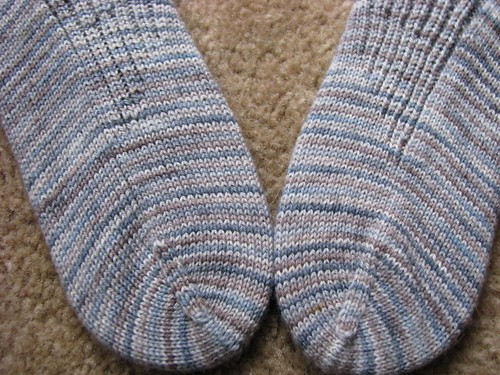
The stockinette portion of the sock clearly shows the beautiful, subtle, not-quite-single-row striping of Cold Waters.

Around the time I received my Cold Waters, I also received a gorgeous pattern from Yarnissima (through a monthly sock yarn club I belong to), The Portland Gussets. I had been looking for the perfect yarn for this pattern, and Cold Waters seemed like it would fit. It had everything I was looking for: medium-length color repeats (too short, and the pattern would be lost in the yarn), not too much color variation (any more, and the yarn would obscure the pattern), but enough visual interest (not enough, and the pattern would be boring).

ColdGussets

I quickly cast on, and the socks just flew off my needles. The pattern and yarn were a great fit!

When you’re knitting hand-dyed yarns, each skein is a unique adventure.  With a little practice, it becomes easy to match a yarn to pattern.  If you take the time to examine the yarn and read its color repeat, the yarn will help you decide which pattern to choose for it.

TAAT Designs is a newly formed design group created by four friends — Trisha, Allison, Abigail and Tesia —  to combine their love of knitting with their desire to create unique and fun patterns for knitted objects of all types.  Read more about their adventures on the TAAT Designs blog.

Under the Influence: Your Opinion Please!

A couple of weeks ago, I changed the theme of my blog (the “theme”, for anyone who is not familiar, is the template that creates the layout of a blog, the way it looks visually).  Previously, I’d been using a theme called Vigilance, which I chose for its clean lines, minimalist style and simple appearance.  I liked it a lot, but I was never happy about the sidebar — I always felt it was hard to see where one item ended and the next began.

So a couple of weeks ago, I went hunting for a new theme and found one I just loved — it’s called Under the Influence and I think it looks great!  It has the same clean lines and simple style that the blog had before, plus a few really cool features like the nifty footer at the bottom of the page (You hadn’t see the footer?  Ooh, quick!… scroll down and have a look!  I’ll wait for you here).  And I’m really happy with the new sidebar — much, much better.

But then, about four days after I installed the new theme, I realised it had one drawback: it’s really hard to see where to leave a comment.  It’s in the small print and it’s just doesn’t stand out that much.

And that’s a huge drawback, because a blog is a two-way conversation, and the comments are the lifeblood of that conversation.  I love hearing from you,  reading your comments, and getting your feedback.  And if it’s hard for you to see where to leave a comment, then all that is going to grind to a halt pretty quickly.

When I first realised, I thought about going back to the old theme  …or maybe looking for yet another one.  But I really like this theme in every other way besides the comment issue, and I’d really like to stay with it.

And I probably will, but I thought I’d ask you guys as well.  Do you think the new theme makes it difficult to leave a comment?  To read others’ comments?  Do you find it confusing  …or did you not even notice the change?  Please leave a comment and let me know.  Just click where it says “Leave a Comment”  (or shows the number of comments) right at the end of this post.

Right there…  No, it’s right there. See it?  Down a bit, and over.  Small type, in red. See it?  There you go!

Cold Waters, a Treasury Surprise

SpaceCadet yarns have been featured in an Etsy Treasury several times now, and each time I have been absolutely delighted to get the news.  There is nothing quite like having your work choosen by your fellow Etsians and highlighted right there on the screen to make you feel all warm, right down to you toes.

But the interesting thing is that, so far, every time my yarns have been included in a Treasury, it’s been the Freshly Cut Grass colourway that’s been picked — every single time!   And that’s great, because it tells me that the green I created for that colourway is as eye-catching to others as it is to me.  But at the same time, I couldn’t help wondering why none of my other colours were ever chosen — or if they ever would be.

So you can imagine my surprise when I clicked on the link in an email today and found that it was not Freshly Cut Grass but instead Cold Waters that had been chosen for the “I Feel Like a Blue…” Etsy Treasury.  I believe I actually let out a whoooop, I was that excited!

Ladies and Gentlemen, I proudly present you Cold Waters, the newest Etsy Treasury star in the SpaceCadet lineup…

Dyes Mixed by Hand, From Primaries

Tucked away in the description of my yarns, right down there in the last paragraph, are these words: “Each item is individually hand-dyed by the SpaceCadet, using professional grade acid dyes which are mixed by hand from primaries”.  That last bit is really important to me — mixed by hand from primaries.  Every colour you see in my yarns and fiber has been created by hand, conjured up from only the primaries and black.  It’s both the entire reason that making hand-dyed yarns excites me so much and the source of more than a little pride for me.

I see a colour in my mind (or, more usually, several colours together) that I know I want to dye and I start dissecting them.  If it’s a purple, is it a red purple or a blue purple?  If it’s a darker shade, I gauge how much black is needed to darken it.  If it’s lighter, I work out the dye-to-water ratio it requires.  And then I calculate in the personality of the fiber — every fiber takes dye in its own unique way, so the same colours can come out wildly different.  And taking all that together, I mix up the dyes in the way that I think is going to create the colour I see in my mind, submerge the yarn, and… wait.

And the moment that I pull the yarn out again, and see whether my calculations — and my instinct — were correct, that is the most exciting moment in the whole dyeing process.  When I get it right,  I go a little wild, grabbing friends, family, any passers-by and saying, “Look! Look! this is the colour I was going for and this is what I got!

Thinking abou this the other day, I wondered if all this excitement wasn’t really a bit ridiculous…?  I mean, really, it’s just colour.  Painters do it all the time, don’t they?  And they not only mix their own colours but then go on to create something with them.  They don’t just sit there crowing over all the little puddles of colours they’ve created on their palettes!

But then I realised that, unlike painters, when I mix my dyes, I’m doing it blind.  The colours in the water are sometimes a good indication, but often not.  And besides, the insides of the dyepots aren’t white so what I see in them is always distorted anyway.  No, there’s no way to know if the colour is right until the yarn goes into the water.  Dyeing is a one-shot deal.

So when I pull the yarn or fiber out of the dyepot and it’s exactly the colour I had envisioned, it’s pretty darned exciting.  For this yarn, I imagined cornflowers, that lovely soft violet-blue that seems to be everywhere this time of year.

Merino and Silk Laceweight Yarn in Cornflowers

When I lifted the yarn out of the dyebath, I knew I’d nailed the colour.  And, yeah, I am really proud to be able to say I mixed these colours by hand from primaries.

Scenes from a Fiber Life: Skeining Off

Sometimes when the undyed yarns arrive, they are already in skeins and sometimes they are on cones.  When it’s the latter, they have to be “skeined off” before they can be dyed.

Each skein is wound off individually onto an antique skein winder, and weighed as it goes along.  Then it’s twisted up into that familiar shape, dropped into the basket, and the next skein begins.

The skein winder goes incredibly fast for being such an old girl, and creates a nice breeze, but there’s no doubting that skeining off is hard work, and tiring if there is a lot of yarn to be wound.  But it certainly is lovely to look at.

But then, when isn’t fiber-stuff lovely to look at?

This post is in honour of the fact that a huge delivery of undyed yarn arrived on my doorstep today, beautiful and smooshy and ripe with colour possibilities.  Look for it to start appearing in the SpaceCadet Creations shop very soon!

A Little Lift for your Wednesday

Wednesdays are hard, I know.  You’re still two long days away from the weekend, and too far from last weekend to go back.  You’re stuck right there in the middle of the work week.  There’s no where to go.

This week, I’ve been attempting to create some new graphics — an ad for Ravelry, and a new banner for the blog and my shop.  It’s all part and parcel of running a small fiber arts business and, while it’s something I’m having to figure out entirely from scratch, I have to say I am really enjoying the learning.  It feels good to stretch  …most of the time.  Sometimes it seems to morph from a learning experience to an exercise in pure frustration, and I am reminded that I am a dyer, a spinner, a knitter — not a graphic artist.

And so it was this week.  I took the pictures, loaded them onto the computer, opened up the software and…  nothing.  Nothing worked the way I wanted it to, nothing would cooperate.  I couldn’t get the graphics to come out the way I’d envisioned them for love nor money   …and so I stopped, and set it all to one side and decided to tackle afresh on another day.

So today is Wednesday, and Wednesdays are hard.  And at some point today, you will come across something that isn’t working for you either, and is just driving you crazy no matter which way you go at it.  When that happens, stop.  Set it aside.  You can tackle it tomorrow, when you are feeling a little fresher.   …When it’s Thursday and you’re that bit closer to the weekend.

And in the meantime, treat yourself to a momentary mid-week pick-me-up, and have a little peek at the one thing that did go right in my little foray into self-taught graphic design: the pictures — just a wee bit fiber eye-candy, to lift your Wednesday.