Shop Update: Bright and Bold

When I reached into this pile of wonderful fibery goodness to choose the yarns I would put into the shop this week, my hand went straight to the brightest shades, the boldest colour combinations.  Eye-candy!

Left to right: Celeste yarn in Flock of Parrots, Iris, Ball of Fire, HeartBeat, Ripe, and Cold Harmony

.

Let me introduce you to them:

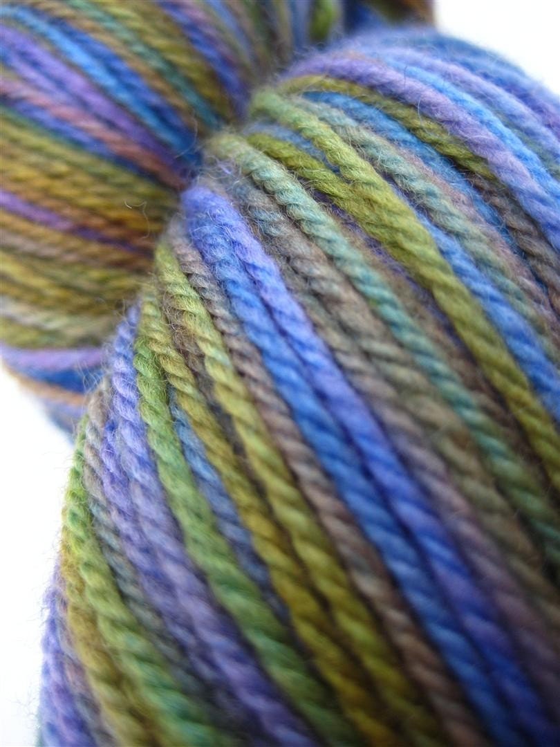
Celeste Superwash Merino Yarn in Iris

Hidden for so long within its vibrant green stalk, when the Iris finally breaks through and reveals its bloom, the rich purple of the petals with its surprising splash of yellow is nothing short of breath-taking.

.

Celeste Superwash Merino Yarn in Cold Harmony

Grey the colour of cold and blustery — cloudy skies over unkind days. And Purple in asucculent shade of zing, a lively sparks that breaks through the grey and breathes life into the day. Together they blend beautifully into a Cold Harmony.

.

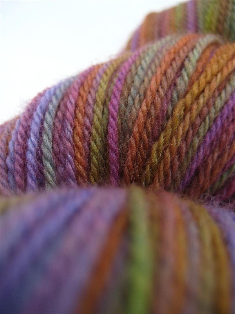
Celeste Superwash Merino Yarn in Ripe

Pink slides lazily into Mauve and, hardly pausing to note the change, then dips softly into Purple. And in the end, which comes out on top? It doesn’t even matter — with colours so gentle and ripe, it’s all good.

.

Celeste Superwash Merino Yarn in Ball of Fire

A Ball of Fire, burning bright, slowly sinking below the horizon… Crackles, hisses, spits and burns… Red, yellow, and orange come flying out in great streaks of colour, escaping across the sky.

.

Celeste Superwash Merino Yarn in HeartBeat

Deep reds and warm pinks like the oxygen-rich blood that carries life on every steady HeartBeat, and cool blue of that same blood as it returns to be replenished again in its life-sustaining circle.

.

Celeste Superwash Merino Yarn in Flock of Parrots

Falling from the tree and caught on the wind in a flash of purple-blue and green and startling yellow, a reminder that there are no caged birds in a Flock of Parrots.


“Just Be Creative!”

Custom orders can be exciting… and daunting.  Dyeing can be an unpredictable process — the slightest change in acidity, temperature, or concentration can create really noticeable colour changes from one dyelot to another.  And it’s just the way life works that those unpredictable changes will always occur on that special order where the customer has a really specific result in mind!

So when a customer contacted me the other week and asked me to dye three custom orders for a birthday celebration for three knitting friends, I had a slight moment of trepidation.   But when I asked her what she had in mind, she put back at my ease: “Just be creative!” she replied.  That I can do!

The birthday girls’ favourite colours are red, purple, and green, and I spent all week letting my imagination run wild on that theme.  I wanted to do a few different colourways of each, and then her choose whatever yarns she liked best.

It wasn’t an easy choice.  Here’s what she picked…

.

Kristen’s HeartBeat


.

Jill’s Storm

.

Natalie’s Steel Leaf


.

I was having so much fun dyeing and just letting my creativity run free that I rather let it run away with me, and I now have quite a stash of exciting new yarns to put in the shop.  Look for them to start appearing Monday or Tuesday of next week!

This Way the Tradewinds Blow

Last week I asked you all to help me choose one of the four Tradewinds to go forward with as a colourway for the shop.  As the responses rolled in, I was so pleased to see so many of you reply and it was really interesting to see which ones you picked.  Thank you all for your comments!  And please do remember to mention your comment on your next SpaceCadet order, so I can be sure to give you that $4 credit.

And so now, which one will it be…?  Well, technically, The Sea Below got the most comments — by one, to be exact.

The Sea Below

However, as the week went on and I was visiting the post again and again to read your responses, and I kept seeing the pictures… and looking the yarns here on my desk…  I realised that it was Westerly that was really calling to me.  So my vote would be for Westerly — one extra vote that brings the count to even for Westerly and The Sea Below.

Westerly

So I think the only fair thing to do is to call it a draw and say that they both deserve to be in the shop!  The next step is to do a few more test runs and make sure that the recipe that worked for the first skein will produce consistent results for future skeins.  One that’s done, you can look for them to appear in the shop over the next couple of weeks!

Trade Winds — Help Me Choose the One

I dye because I love playing with colour.  And when I free myself from the (usually self-imposed) requirement to create a specific hue or shade, and instead just let myself be drawn into pure experimentation, I find real joy in the process.

Last week, I did just that.  I created a basic colour recipe, and then tweeked it, and tweeked it again, and then once more…  and dyed one skein in each, just to see how they’d come out.

The Trade Winds Clockwise from top left: Westerly, Northeasterly, Southeasterly, and The Sea Below

Trade winds blow great ships across the sea, their sails billowing, their hulks lying heavy in the blue and green waters, laden down with trunk upon trunk of brightly coloured silk fabrics, and barrels filled with the warm shades of precious spices.

Because the recipes (and the resulting colourways) are so close, I’m going to choose only one colourway to dye for the shop in future.  But… I’m not sure which one to pick.   And so I’d like to ask you, dear readers, for your help.  Which one would you pick?  Please tell me!

And, just to add a bit of fun, I’ll give a $4 credit on your next order from SpaceCadet Creations to everyone who leaves an answer in the comments here before midnight on Friday.  Howzat then?  Sound good?

So, go on then!  Tell me which colourway you’d pick!

Small print:  Comments must be left on this blog post before midnight on Fri Oct 1 2010.  Limited to one $4 credit per household.  Comments must name a colourway chosen from the four listed to be valid.  Multiple comments will not count for multiple credits. Commenter must list a valid email address when leaving the comment and then use that same email address when placing the order with SpaceCadet Creations, in order to be properly credited. The $4 credit must be claimed via the message section when placing the order on Etsy, in order to be properly credited.

She Likes Winter, Snow, and Ice: Shop Update

Megan was thinking of a cardigan, something simple, with a crew neck… maybe with snowflakes.  The kind of go-to cardigan that could keep her warm and cosy all winter long.  She was excited to get it on her needles, and asked me to dye the colours of Frost.

It would have white, of course, and a soft silver grey, and…  and… ah yes, that lovely cool blue of winter shadows.  I couldn’t wait to get started!

The key was getting the balance right: the amount of white to blue to grey, and the intensity of the colours.  Frost can be soft and light, or it can hard and crisp; sparkling bright in the sun, or shadowy and blue.   I wanted to make sure that Megan got the Frost that she had in her mind, so I dyed it twice and let her choose.

This is Megan’s Frost:

I loved pulling the yarns out of the dyepot, seeing how the colours came together.  But, better than that, Megan loved the colours — she said her yarn was exactly what she was hoping for.  And I can tell you that nothing is so nice for a dyer to hear!

The silver-grey Frost and more skeins of the shadowy-blue Megan’s Frost are in the SpaceCadet’s shop.

The Trouble with Cameras: Shop Update

One thing I’ve discovered since opening SpaceCadet Creations is that I really love photographing yarn.  I really love it.  When I get the camera in there, in close, and the light is just right and colours are popping and I can almost feel the texture coming right through the picture, I get so excited.  Mmmmm… yarn porn — is there anything better?

And I suspect that paragraph is completely incomprehensible to anyone who is not yarn-crazy…  But you understand, don’t you?  Yeah, you know exactly what I’m talking about.

But sometimes, it goes wrong.  I’ve got my camera there, the light is right, the macro is doing its thing…  but the colours just aren’t coming out right.  It should be working, but it’s just not.  And I can’t tell you how crazy-making it is when that happens — because I’ve put a lot of effort into the colours I put in my yarns, and it’s incredibly frustrating when I just cannot get the camera to capture those colours.

This week, I’ve put a bunch of gorgeous yarns in the shop.  I love them!  Some are sublimely coloured, some are subtle, and some are quirky, but they’re all  beautiful to look at…

Clockwise from left: Celeste yarn in Plumberry, Stella yarn in Megan’s Frost, Astrid yarn in Sailor’s Warning, Celeste yarn in Sweetpeas, Celeste yarn in Night Sky, and Celeste yarn in Sweet Decay.

But see that one in the middle, down at the bottom?  The one with a lot of blue and what looks like maybe black?  That was one of those yarns that simply refused to be photographed.  Flat out refused.  Oh, it looks nice enough in the picture but, in real life, it’s just so much more — deep, vibrant purples, dark greens and browns, amazing blues.  It’s so dark and rich and moody…  truly stunning.  But could I capture that on film? Could I heck!  And it was driving me crazy!

So, if you can’t fight it, join it.  So, here’s how I’m going to look at it:  see that picture there in the middle, and the bottom of the page?  That one is there to make all the other pictures look even better.  Seriously — look at them.  Doesn’t that one picture make the colours in the one above it look so subtle and soft?  And doesn’t it just make the pinks in the one to the right look vibrant?  See what I mean?

And so that bad picture serves a good purpose now.  But what’s even better is what will happen when someone buys that yarn…  Because when they pull it out of the box and see its true colours…  they’re going to understand just how frustrating that camera can be!