Scenes from a Fiber Life: the Art and Science of Hand-Dyeing

Years ago, when I was a corporate buyer, I remember my boss explaining that buying was both an art and a science.  I didn’t really understand what he meant at the time — surely it was just a matter of knowing how much should be in stock and plugging in the numbers, wasn’t it?  It was simple.  What was he on about “art”?

I didn’t really get it until I’d been in the job for some time, and I found myself explaining some of the basics to our intern.  She was plugging in the numbers — just plugging in the numbers — and coming to conclusions that I knew would spend our money in all the wrong places.   And as I explained that there was more to it than just the number, that was the moment that I realised what my boss meant by “art”.  Over time, I’d been quietly and unconsciously learning to follow to my instincts as well as the numbers, learning to apply both art and science.  And when I watched that intern making those simple, novice mistakes, I began to understand the value of staying tuned into both.

Today I tried to duplicate Westerly, the beautifully shaded colourway from the Tradewinds quartet that I showed you last week.  And there I was, duplicating the recipe exactly when…  I just suddenly didn’t trust it.  My instinct told me the colours weren’t right.  My instinct told me to add a bit of this, mix in a little more of that…

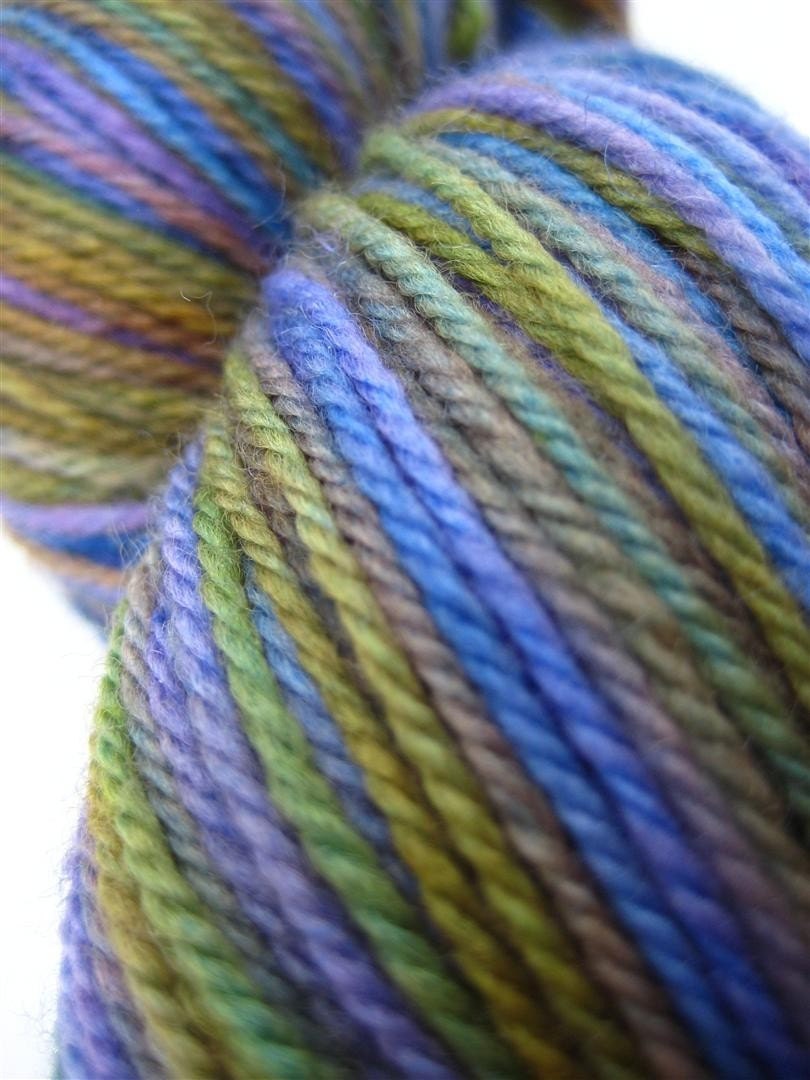
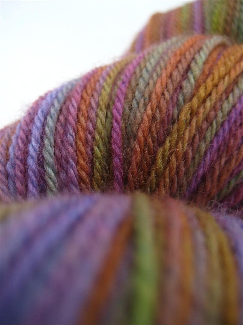
My instict wasn’t right.  This is what came out of the dyepot…

.

It’s beautiful for sure, but it’s not Westerly.  And though I think I’m going to love it when it’s dried and reskeined…  there’s no denying that it’s not Westerly.

.

Which just serves to remind me that, even though dyeing is undoubtedly an art as much as a science, and even though a dyer’s colour sense is borne of instinct, it’s important to remember and never to forget the first rule of the second dyelot: even when you want to follow your instinct…

FOLLOW THE RECIPE!

This Way the Tradewinds Blow

Last week I asked you all to help me choose one of the four Tradewinds to go forward with as a colourway for the shop.  As the responses rolled in, I was so pleased to see so many of you reply and it was really interesting to see which ones you picked.  Thank you all for your comments!  And please do remember to mention your comment on your next SpaceCadet order, so I can be sure to give you that $4 credit.

And so now, which one will it be…?  Well, technically, The Sea Below got the most comments — by one, to be exact.

The Sea Below

However, as the week went on and I was visiting the post again and again to read your responses, and I kept seeing the pictures… and looking the yarns here on my desk…  I realised that it was Westerly that was really calling to me.  So my vote would be for Westerly — one extra vote that brings the count to even for Westerly and The Sea Below.

Westerly

So I think the only fair thing to do is to call it a draw and say that they both deserve to be in the shop!  The next step is to do a few more test runs and make sure that the recipe that worked for the first skein will produce consistent results for future skeins.  One that’s done, you can look for them to appear in the shop over the next couple of weeks!

A Cowl in Colours to Inspire!

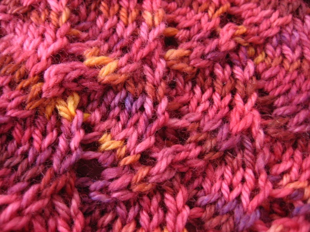
“I’m inspired!” Heather said after reading Pattern Roll-Call: Something Gorgeous Around Your Shoulders, and she ordered a skein of Celeste in Red Brick.  Last week, she showed me what she made with it.  It’s a gorgeous, lacy cowl — I don’t think she could have picked a nicer pattern.   And I thought you might like to see too…

.

The pattern is Eclipse by Jacquelyn Ridzy — so simple and really lovely.

.

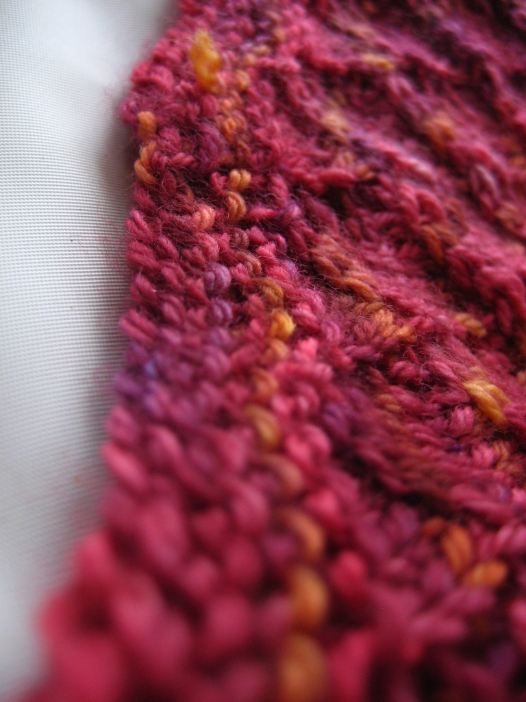
It always amazes me how the colours in yarns totally transform when it’s knitted up.  Look at the way the red flows into the purple!  And those little flecks of gold really pop.

..

And it’s got this sweet little garter-stitch border.  I love it!

.

I can’t tell you how much I love it when people share their projects with me.  Thanks, Heather — your cowl is gorgeous!

Trade Winds — Help Me Choose the One

I dye because I love playing with colour.  And when I free myself from the (usually self-imposed) requirement to create a specific hue or shade, and instead just let myself be drawn into pure experimentation, I find real joy in the process.

Last week, I did just that.  I created a basic colour recipe, and then tweeked it, and tweeked it again, and then once more…  and dyed one skein in each, just to see how they’d come out.

The Trade Winds Clockwise from top left: Westerly, Northeasterly, Southeasterly, and The Sea Below

Trade winds blow great ships across the sea, their sails billowing, their hulks lying heavy in the blue and green waters, laden down with trunk upon trunk of brightly coloured silk fabrics, and barrels filled with the warm shades of precious spices.

Because the recipes (and the resulting colourways) are so close, I’m going to choose only one colourway to dye for the shop in future.  But… I’m not sure which one to pick.   And so I’d like to ask you, dear readers, for your help.  Which one would you pick?  Please tell me!

And, just to add a bit of fun, I’ll give a $4 credit on your next order from SpaceCadet Creations to everyone who leaves an answer in the comments here before midnight on Friday.  Howzat then?  Sound good?

So, go on then!  Tell me which colourway you’d pick!

Small print:  Comments must be left on this blog post before midnight on Fri Oct 1 2010.  Limited to one $4 credit per household.  Comments must name a colourway chosen from the four listed to be valid.  Multiple comments will not count for multiple credits. Commenter must list a valid email address when leaving the comment and then use that same email address when placing the order with SpaceCadet Creations, in order to be properly credited. The $4 credit must be claimed via the message section when placing the order on Etsy, in order to be properly credited.

She Likes Winter, Snow, and Ice: Shop Update

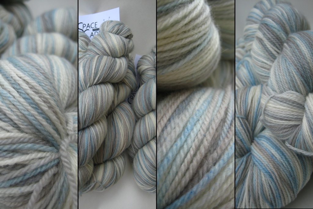
Megan was thinking of a cardigan, something simple, with a crew neck… maybe with snowflakes.  The kind of go-to cardigan that could keep her warm and cosy all winter long.  She was excited to get it on her needles, and asked me to dye the colours of Frost.

It would have white, of course, and a soft silver grey, and…  and… ah yes, that lovely cool blue of winter shadows.  I couldn’t wait to get started!

The key was getting the balance right: the amount of white to blue to grey, and the intensity of the colours.  Frost can be soft and light, or it can hard and crisp; sparkling bright in the sun, or shadowy and blue.   I wanted to make sure that Megan got the Frost that she had in her mind, so I dyed it twice and let her choose.

This is Megan’s Frost:

I loved pulling the yarns out of the dyepot, seeing how the colours came together.  But, better than that, Megan loved the colours — she said her yarn was exactly what she was hoping for.  And I can tell you that nothing is so nice for a dyer to hear!

The silver-grey Frost and more skeins of the shadowy-blue Megan’s Frost are in the SpaceCadet’s shop.

The Trouble with Cameras: Shop Update

One thing I’ve discovered since opening SpaceCadet Creations is that I really love photographing yarn.  I really love it.  When I get the camera in there, in close, and the light is just right and colours are popping and I can almost feel the texture coming right through the picture, I get so excited.  Mmmmm… yarn porn — is there anything better?

And I suspect that paragraph is completely incomprehensible to anyone who is not yarn-crazy…  But you understand, don’t you?  Yeah, you know exactly what I’m talking about.

But sometimes, it goes wrong.  I’ve got my camera there, the light is right, the macro is doing its thing…  but the colours just aren’t coming out right.  It should be working, but it’s just not.  And I can’t tell you how crazy-making it is when that happens — because I’ve put a lot of effort into the colours I put in my yarns, and it’s incredibly frustrating when I just cannot get the camera to capture those colours.

This week, I’ve put a bunch of gorgeous yarns in the shop.  I love them!  Some are sublimely coloured, some are subtle, and some are quirky, but they’re all  beautiful to look at…

Clockwise from left: Celeste yarn in Plumberry, Stella yarn in Megan’s Frost, Astrid yarn in Sailor’s Warning, Celeste yarn in Sweetpeas, Celeste yarn in Night Sky, and Celeste yarn in Sweet Decay.

But see that one in the middle, down at the bottom?  The one with a lot of blue and what looks like maybe black?  That was one of those yarns that simply refused to be photographed.  Flat out refused.  Oh, it looks nice enough in the picture but, in real life, it’s just so much more — deep, vibrant purples, dark greens and browns, amazing blues.  It’s so dark and rich and moody…  truly stunning.  But could I capture that on film? Could I heck!  And it was driving me crazy!

So, if you can’t fight it, join it.  So, here’s how I’m going to look at it:  see that picture there in the middle, and the bottom of the page?  That one is there to make all the other pictures look even better.  Seriously — look at them.  Doesn’t that one picture make the colours in the one above it look so subtle and soft?  And doesn’t it just make the pinks in the one to the right look vibrant?  See what I mean?

And so that bad picture serves a good purpose now.  But what’s even better is what will happen when someone buys that yarn…  Because when they pull it out of the box and see its true colours…  they’re going to understand just how frustrating that camera can be!