Understanding Colour: Variegateds, from Gentle to Wild

Understanding Colour: Variegateds, from Gentle to Wild

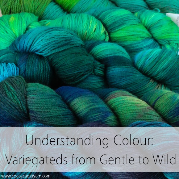
Last week we talked about the different meanings of the colour terms “solid”, “semi-solid”, and “tonal” — all of which refer to yarn dyed in a single hue.  But so often the yarns that really send our pulses racing are the multi-hued colourways — layer upon layer of fabulous colour, almost glowing in our hands as we turn them over and over to catch every last shade.  These are variegated colourways and, beautiful as they are, they can be intimidating.  But there are different types of variegateds and, once you realise the differences, they become much more approachable.

Understanding Colour -- Variegateds from Gentle to Wild

So first, let’s define what we’re talking about.  The straight-up definition of a variegated colourway is any colourway that contains more than one hue (colour). So, going back to last week’s post, if a yarn contains light kelly green and mid-kelly green and dark kelly green, it’s not variegated, it’s tonal because the hue of all the greens is the same.  But if a yarn contains a yellow-green and a blue-green as well as the kelly green, now it’s got mutiple hues (colours) and that makes it variegated.  To put it very simply: in a variegated colourway, the colour varies.

But there’s far more to “variegated” than just that simple definition.  Here at SpaceCadet, we tend to divide our variegateds into two categories: Gently Variegated and Wildly Variegated, and the good news is that they are exactly what they sound like.

Gently Variegateds: The Easy-to-Love Variegateds

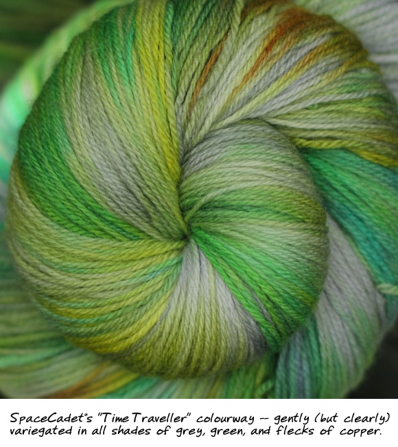
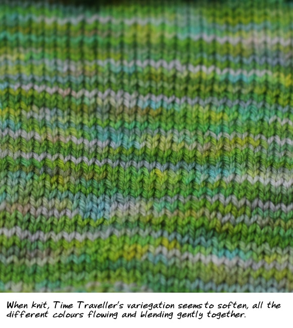
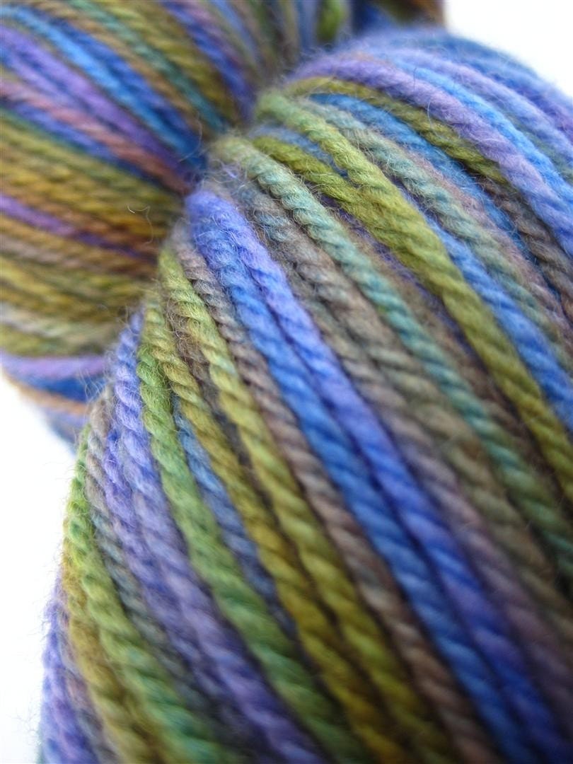
Gently Variegated colourways are low contrast — their colours blend and flow into one another.  Think of our colourway Time Traveller, all shades of green and gray and gentle flecks of copper.  There are actually a whole bunch of colours in there — it’s definitely variegated — but none of them are jarring against each other.  In fact, although the yarn looks clearly variegated in the skein, when you knit it up, it’s quite startling just how much the different colours begin to flow into each other.  In fact, if you back up a few feet, it all begins to blend together as if it were hardly variegated at all.

SpaceCadet's Time Traveller

SpaceCadet's Time Traveller Knitted

Wildly Variegateds: The Bad Boy Colourways You Can’t Help Falling For

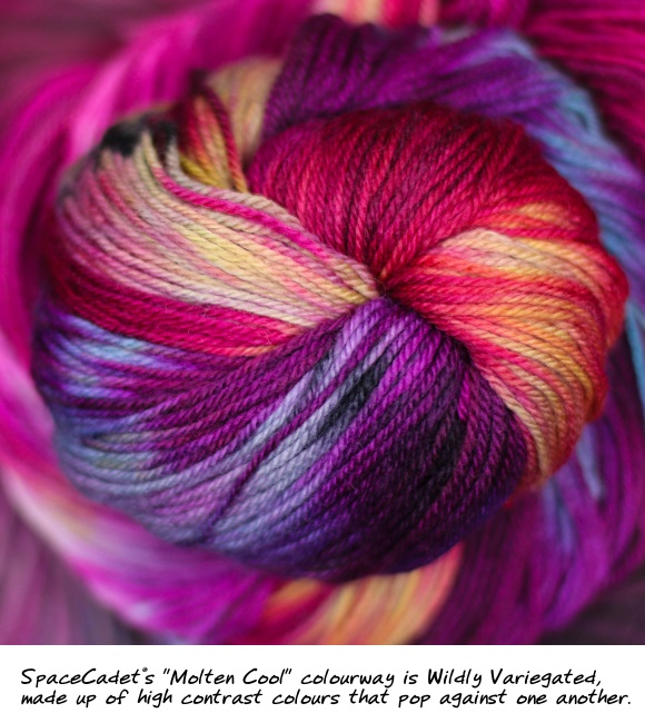
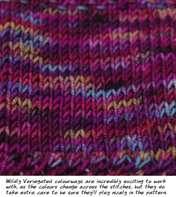
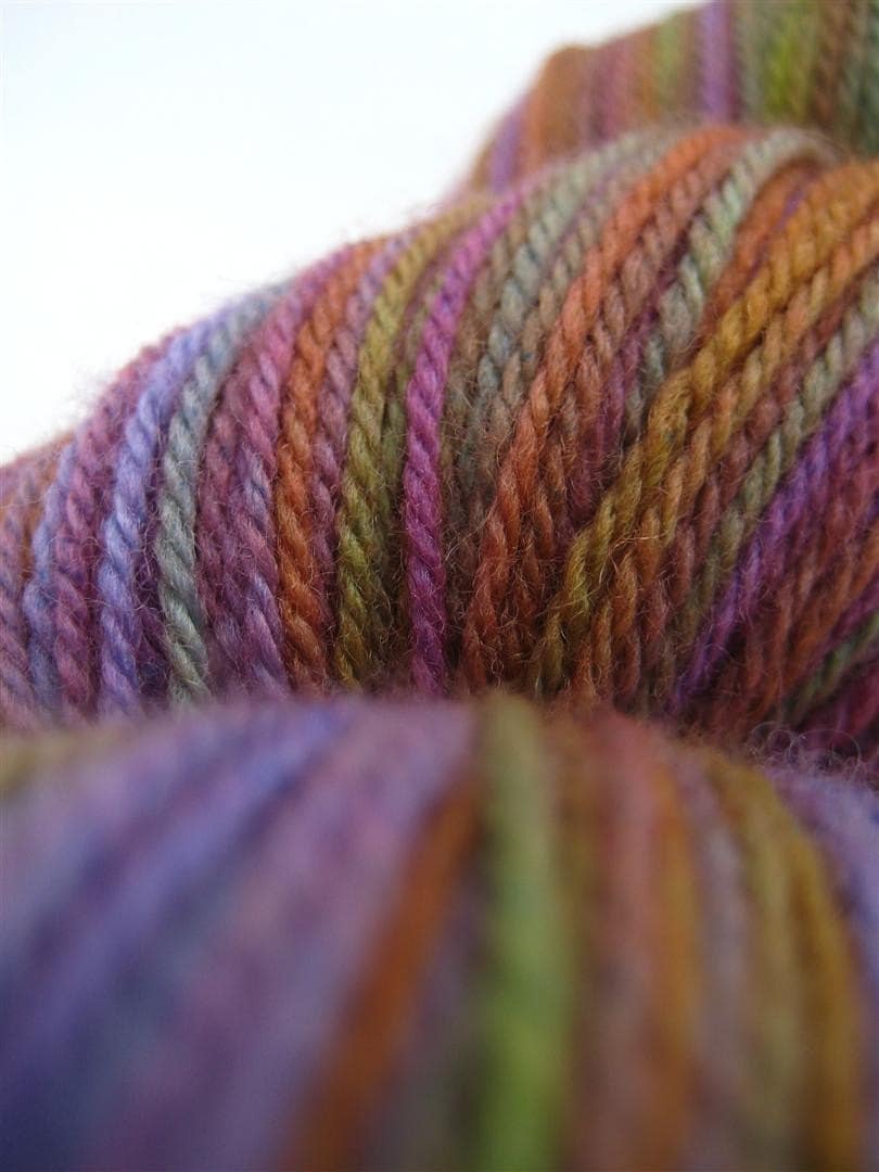
Wildly Variegated colourways are high contrast, containing hues that pop and sizzle against one another.  These are colours that jump around on the colour wheel, like the rust-and-blue combination in Windswept or the maroon-blue-yellow of Molten Cool. They’re incredibly exciting to knit or crochet with, the colours morphing and changing across your stitches.  But because they are high contrast, they can be high maintenance as well — there’s a push-pull element to the colours that means that, unlike Gently Variegateds, they may not play nicely together in plainer stitches.

SpaceCadet's Molten Cool

SpaceCadet's Molten Cool Knitted

So, so far, so simple.  Variegateds are colourways that contain more than one hue (colour).  Gently Variegateds are low contrast and Wildly Variegateds are high contrast.  Easy, right?  Yep, so let me complicated it just a bit.

When Gentles Go Wild (And Vice Versa)

There’s another element to what makes us perceive a variegated yarn as either Gentle or Wild, and this one defies the neat definitions we discussed above.  That element is the specific layouts of the colour repeats.  Or put more simply: how quickly and often the colour changes.

A yarn with long colour repeats will tend to look more variegated regardless of whether the hues are high or low contrast, simply because those long stretches allow the colours to separate in your knitting or crochet.  Depending on your project, they may stripe (or semi-stripe), pool, argyle, or create irregular flashes.  And when there are these sorts of large, distinct areas of a single hue which abut other distinct areas in a different hue, our eyes more easily perceive those colour changes and the colourway appears to have higher contrast (even when the two hues are similar).

And the reverse is true as well: when a yarn has many short colour repeats, it tends to look less variegated, regardless of whether its hues are high or low contrast.  Short, quick colour repeats create tiny pops of colour that sit right next each other in your knitting without such distinct edges.  Because of this, our eyes perceive even a wildly variegated colourway almost as a single, multi-hued colour (as if such a thing were possible) and the whole thing appears to be lower contrast.  Think of a heathered yarn, which may have anything from grays and browns to blues, greens, yellows, and perhaps even hot pinks — and yet, because the colour changes are many and often, they all blend together in a way that could almost be described as soft.

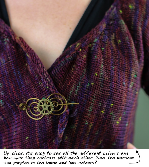
A Wildly Variegated colourway looks gentle thanks to short colour repeats

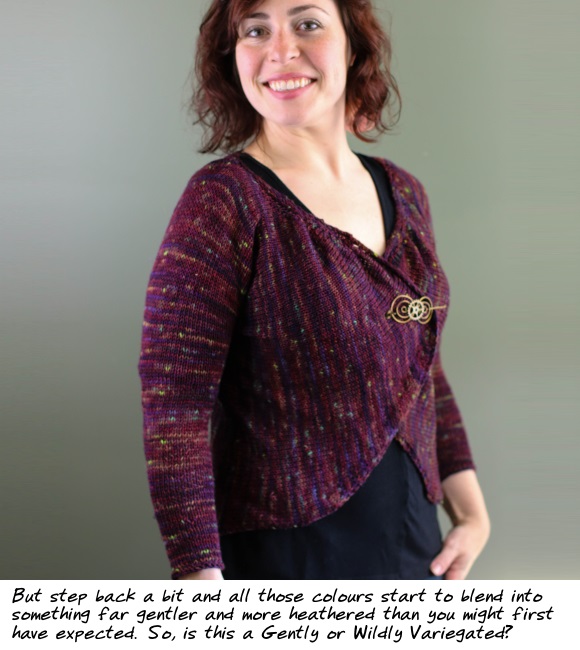
A Wildly Variegated colourway looks gentle thanks to short colour repeats (2)

Here’s a great example:  this is Mythos by Laura Nelkin, which my assistant Jade knit in a one-of-a-kind colourway we created last year.  If you look closely, you can see that the colours are actually very high contrast — there are maroons, purple-blues, dusty aqua, lime green, and even yellow.  By definition, it’s a Wildly Variegated colourway (and kind of sounds like it should be approaching the dreaded clown barf).  But, in reality, the short repeats give only pops of colour instead of stripes or pooling.  And the result is a colourway that is Gently Variegated and almost heathered — proof that even high contrast colourways don’t have to be so wild after all.

Now It’s Your Turn…

So now that we’ve gone over the terms, here are two exercises to give you hands-on practice in understand these different types of variegateds:

  • First, go to the SpaceCadet colourways page and scroll to the bottom to see our variegated colourways.  Mentally note which look Gentle and which look Wild to you, and then compare it what we consider Gentle or Wild by clicking on the buttons at the top (you’ll see them marked “Gently Variegated” or just “Variegated” — I left off the word Wild because I didn’t want to them to sound scary).  Remember that although there are clear definitions for both, there are no right or wrong answers — the perception of wild vs gentle is pretty subjective.  Even very high contrast colours can look Gentle if they are configured the right way; and low contrast colours can start to look a little Wild if they are allowed to pool, flash, or stripe.
  • And then, go and look at your own stash and see what you gravitate to.  Do you have a lot of yarns with colours that blend and flow into one another, or that are close on the colour wheel?  Or is your stash filled with yarns whose colours that contrast sharply with one another?  Open the skeins up to see how long the colour repeats are, and think about how is that going to affect the way the yarn looks when it’s knitted or crocheted.  Most importantly, how do you feel about the colourways in your stash?  Are you excited to work with them and see how they come out or are you a little intimidated by them?  Ultimately, whether Wild or Gentle, low contrast or high, the how we feel about the end result is what really matters.  But we’ll get better results from our yarn — and our yarn shopping — if we really understand what draws us to the yarns we love.

Next up in this series: a colourway that seemingly defies all these definitions… and what makes it so interesting.  I’ll be posting that sometime in the next week or so — don’t miss it!

Adding Colour to Little Things and Big

Ok, it’s not actually Monday but, at least here in the US, it feels like a Monday, so let’s brighten the morning up with some great Mini-Skein ideas!

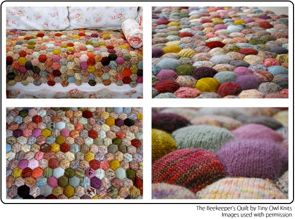
Y’know, as I was scrolling through Mini-Skein ideas this week for the SpaceCadet’s Mini-Skein Ideas board on Pinterest, the thing that struck me was how versatile they actually are.  I mean, when the Mini-Skein craze started, it was all about hexipuffs — tiny little six-sided pillows that give instant gratification and are eventually all put together into the stunning Beekeeper’s Quilt.

The Beekeeper's Quilt

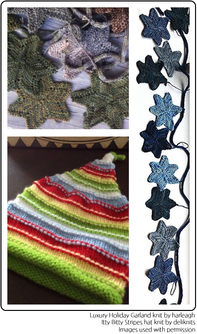
And those little puffs get us thinking about using Mini-Skeins for mini-sized projects.  Two of my favourites that I spotted on Pinterest this week are the Itty Bitty Stripes hat, knit by deliknits from a pattern by Susan B. Anderson, and the Luxury Holiday Garland, knit by harleagh from a pattern by  Kristen Ashbaugh-Helmreich.  Both of patterns use small amounts of yarn highlight colour in a whimsical (and delightful way).  Who can look at that sweet little hat and not smile?  Or resist that garland of happy stars when holiday-time rolls round?  Yes, Mini-Skeins really lend themselves to mini-projects like these.

Small things with Mini-Skeins

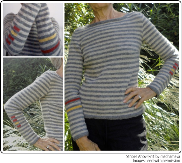
But I think what is really cool is the way people are using Mini-Skeins now to add tiny pops of colour to full-sized projects.  More and more on Pinterest, I see designs that use yarn as if it were a crayon to add colour here there and everywhere…   Sweaters or cardigans with a gorgeous bright edging…  Or maybe a gently contrasting collar or cuffs.  Or… or… something really innovative and exciting — like the Stripes Ahoy! sweater, knit by machamaya and designed by Asa Tricosa.  Isn’t it fantastic?!?  I love how she’s used colour in a unexpected way to turn a simple design into something really eye-catching.

Stripes Ahoy!

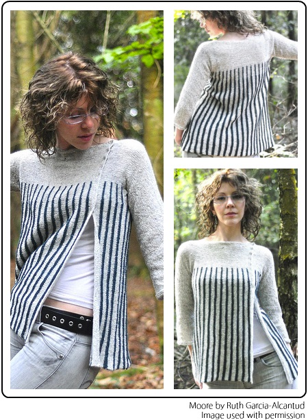
And finally, I want to share Moore, a design by one of my favourite designers, Ruth Garcia-Alcantud of Rock & Purl.  It’s eye-catching of course because of its unusual off-center shaping, and side-to-side construction.  But imagine if you took those stripes and, instead of doing the pattern in just two colours, you used Mini-Skeins to add a whole spectrum of colour?  It’d be stunning, right?  No need to imagine — just click here and see how it would look!

Moore by Ruth Garcia-Alcantud

You see what I mean about how versatile Mini-Skeins can be?  The more I go through ideas on Pinterest, the less I think of them as yarn and more as yarn-crayons, to add colour where-ever it’s going to add impact to a project.  What more of that?  Follow the SpaceCadet’s Mini-Skein Ideas board on Pinterest and get inspired to colour your world too!

Inspiration for Colour in Knitting and Dyeing

A few years ago, I took a class with Brandon Mably that completely changed the way I thought about colour.  It was an intense 2-day course which challenged us to think about how we see and use colour from the minute we arrived in the morning, until we left at the end of the day.  Brandon had us doing a lot of crazy things to shake up our brains, from throwing all our balls of yarn into the center of the floor and mixing them all up, to free-knitting swatches that contained 10… 15… 20 different colours.  It was a great weekend (and if you ever get a chance to take Brandon’s Design in Colour class, I highly recommend it).

And there’s one technique that he taught that has translated particularly well from knitting to dyeing.  He suggested that we use artwork that we love — paintings that really spoke to us — and use the colours as inspiration.  If those colours work in the painting, then they would work in our knitting too.  He walked around the room and let us choose from a stack of fine-art postcards and greeting cards, whichever painting called out to each of us the most.

.

The thing about using this technique is that you suddenly realise how many colours you don’t see, even as they are right in front of your eyes.  When you first look at a painting, you may see what you think of as a “yellow painting”…

.

But when you take the time to really immerse yourself into the colour, you suddenly see so much more — little spots of red that jump out at you, the grays that fade into the background, subtle greens that you didn’t even notice.  They all work together — these colours that you never would have thought of putting side-by-side — and they create a depth and complexity that pulls you back again and again.

Just realising that really began to set us free in that class, and we dove into the pile of yarn in the middle of the floor.  Using our cards as a guide, everyone’s knitting exploded into wild colour —  combinations of shades far more daring than we would have tried before.

.

And then Brandon showed us a something else that I hadn’t noticed: different areas of the the same painting contain their own micro-colourways, and give off completely different moods from what you felt when you first saw the painting.  So if you take a painting that you think of as mostly sunny and yellow, and cover part of it up, you might find an area that’s completely different…  that’s moody and blue…

And when you switch your hands around again, the whole mood changes back to the sunny and yellow you saw before.  Or maybe to a different section, and a different colourway and mood.  Here are little colourways that you can pull out for inspiration in your knitting, and that I use in my dyeing — a whole world of colourways in one painting, just waiting to inspire you, if you stop and look closely enough!  And once you start seeing them, you really can’t wait to start using them yourself…  to start knitting as though you’re painting.

.

(When I lived in the UK, fine art cards like this one from Woodmansterne were available in any card shop for just a couple of pounds.  But here in the US, I don’t regularly see cards like this — the shelves seem to filled with the standard assortment of greetings cards with nice-but-not-overly-interesting artwork.  I’d love to find a good supplier of art cards like this one to inspire me…  Can anyone suggest where I might find something similar here in America?)

Cadet Credits, With Thanks to You

The first few days of January are probably supposed to be about looking forward, but I cannot help looking back.  2010 was a great year here at SpaceCadet Creations — it’s been exciting, it’s been educational, sometimes it’s been a bit scary, it’s always been colourful!…  And most of all, it’s been successful.  And ladies and gentlemen, I know that success is entirely down to you.  You’ve been encouraging me, supporting me, talking to me… and buying my yarn and fiber.  I am incredibly grateful.

For a little while now, I’ve been thinking about how I can show you my thanks, how I can make it real.  And so I am very excited to introduce SpaceCadet’s Cadet Credits, a way to reward my loyal customers and let them know how much I appreciate them.  Here’s how it works:  I will give you a $10 credit every time your purchases accumulate to $150 (minus discounts, taxes, and shipping costs).  Your credits will never expire, you can use them right away or saved them up to be used all together, and they can be used on anything in the SpaceCadet Creations shop.  It’s my way of showing you how much your support has meant to me throughout 2010.

And that last sentence up there…  that’s not just some kind of marketing waffle to make you feel good.  I really mean it.  So I’m not going to implement Cadet Credits from just today onwards, I’m going to give credit to my customers for all their purchases throughout 2010.   Don’t worry — you don’t have calculate a thing.  I’ll kept track of all the numbers and will be emailing you shortly to let you know how much credit you have, or how close you are to earning one.

And with that, it is time to look forward to 2011 — it’s going to be an exciting year!  There are a lot of great things planned here in the SpaceCadet studio — some I’ll tell you about as they develop, and some that will stay top-secret until they’re ready for their reveal.  I can’t wait to get started.

But you…  You can start celebrating 2011 right away.  So go on!  Go spend those credits!


For full details of the Cadet Credit Programme (it’s not complicated!), click here.

I Can’t Show You This Yarn

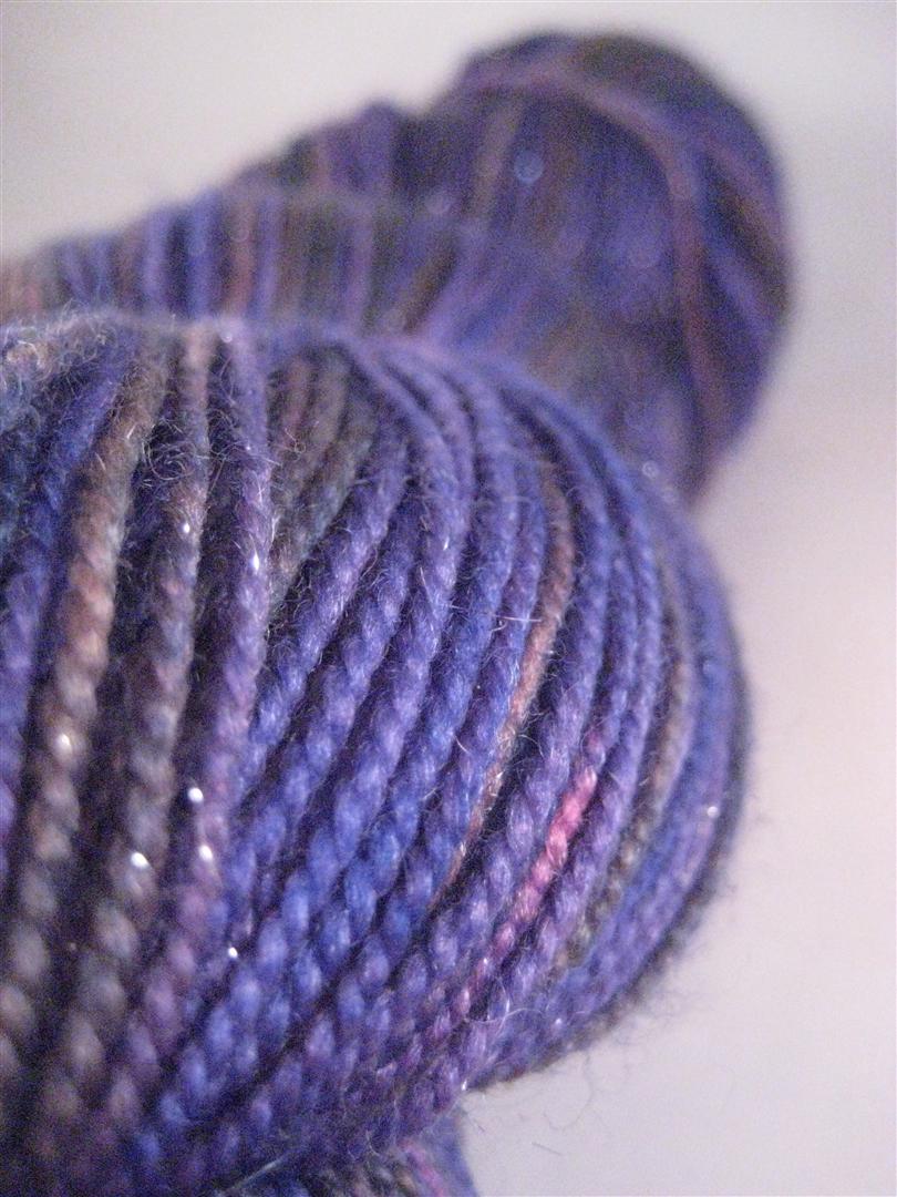
I’ve dyed two skeins of my lovely sparkly Lucina yarn in the colourway Southeasterly.  It’s an amazing blend of deep purples and seaweed greens.  The sparkles in the yarn shimmer in the light, and it is absolutely gorgeous.

And my camera simply won’t photograph it.

.

My camera has always struggled with purples.  Time and time again, they come out more blue than they really are.  I’ve tried adjusting all sorts of things on the camera — the white balance, the colour settings, the exposure compensation — but to no avail.  I’ve tried manipulating the colours after I download the picture to make them more realistic, but they refuse to play. Purples come out blue, and a horrid garish blue at that.  And so I have no way to show you what this yarn really looks like.

Which is a real shame, because it’s beautiful.  It took my breath away when I pulled it out of the dyepot.  The colourway is Southeasterly and is much like the yarn I dyed in this colourway before

.

But this time, it’s so much more intense, so much more striking.  And then with the sparkles too…

I wish I could show it to you, I really do.  But you’re just going to have to believe me when I say it doesn’t look like this.  It really doesn’t look like this — it is so, so, soooo much better.

.

And if there are any photographers out there who can tell me what I am doing wrong, I’d be incredibly grateful for any suggestions.  …Or, better yet, if there are any knitting photographers who want to come round and give me a lesson on capturing better purples, there might be a skein or two of yarn in it for you..!

This Way the Tradewinds Blow

Last week I asked you all to help me choose one of the four Tradewinds to go forward with as a colourway for the shop.  As the responses rolled in, I was so pleased to see so many of you reply and it was really interesting to see which ones you picked.  Thank you all for your comments!  And please do remember to mention your comment on your next SpaceCadet order, so I can be sure to give you that $4 credit.

And so now, which one will it be…?  Well, technically, The Sea Below got the most comments — by one, to be exact.

The Sea Below

However, as the week went on and I was visiting the post again and again to read your responses, and I kept seeing the pictures… and looking the yarns here on my desk…  I realised that it was Westerly that was really calling to me.  So my vote would be for Westerly — one extra vote that brings the count to even for Westerly and The Sea Below.

Westerly

So I think the only fair thing to do is to call it a draw and say that they both deserve to be in the shop!  The next step is to do a few more test runs and make sure that the recipe that worked for the first skein will produce consistent results for future skeins.  One that’s done, you can look for them to appear in the shop over the next couple of weeks!